
AI made polished brand design cheap, so polished no longer works. Here are the 4 tactics from AI playbooks that winning brands strategically use.
Two years ago, "AI brand design" was mostly a punchline. A logo generator, a Midjourney render, a founder in a Slack asking why they should pay a studio when ChatGPT can spit out a moodboard in ninety seconds.
That conversation is over. AI is in the stack now. Every studio uses it. Every founder we pitch has already tried it. The question isn't whether to use it. It's what actually still works when everyone has the same tools.
At Supercharged, we've shipped brand systems across insurtech, immigration, wealth management, F&B and luxury travel since the shift. Four patterns keep proving true.
An adaptive brand system is an identity built as a set of context-aware variations rather than a single fixed mark.
The core symbol, type, and colour tokens are designed to flex across a 16px favicon, a dark-mode app icon, a full-bleed billboard, and a TikTok caption card without breaking.
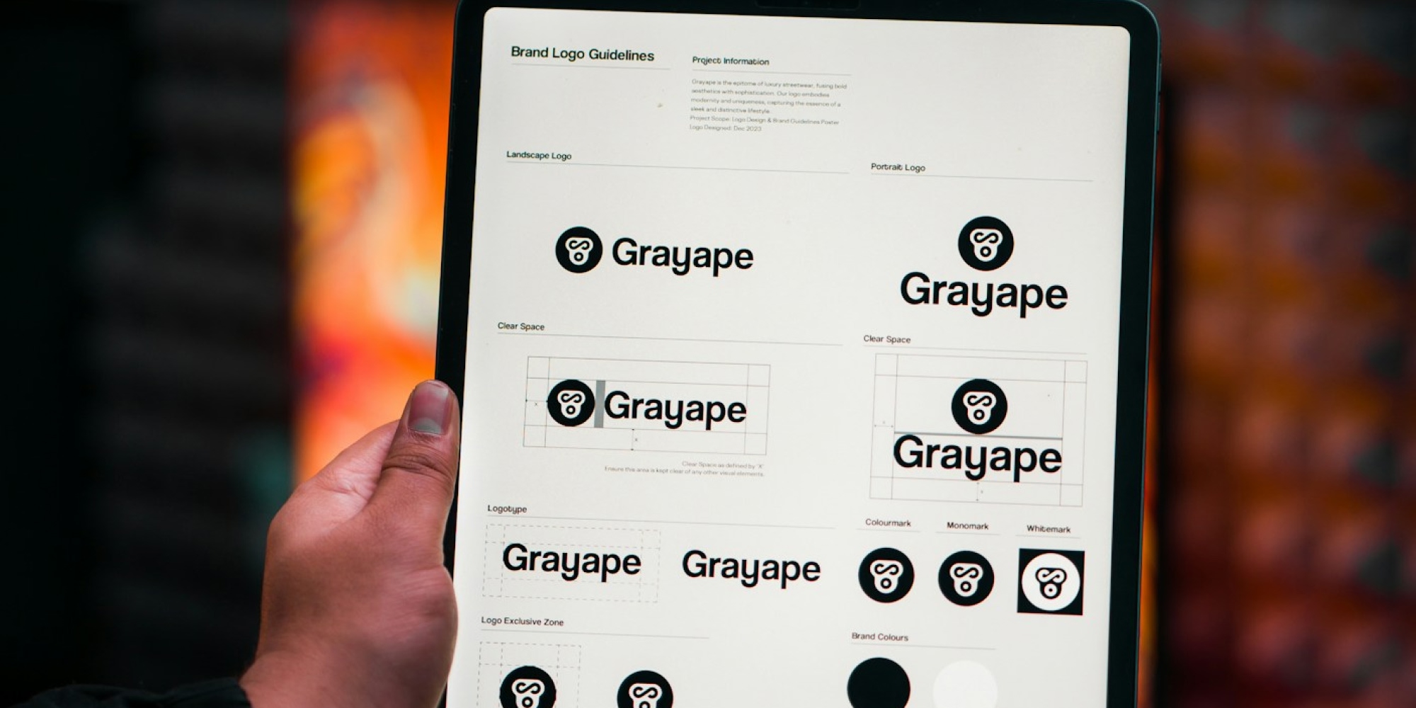
The one-logo, one-lockup, one-palette era is dead. A brand today lives in a Figma file, a Slack sticker, a Vercel deploy preview, an OpenAI-style app icon and a printed business card. All at once. It has to flex without falling apart.
Static Logo
Adaptive Brand System
Our work on Panache World and Convictional both leaned hard into this. A spine identity that could stretch across print, product and campaign without needing a "special version" every time.
If your identity can only exist in one hero rendering, it's already broken.
This one surprised me.
The obvious bet was that AI-native brands would leverage AI in every touchpoint. Generative avatars. Dynamic hero images. Endless variants. That's not what's happening. The brands actually pulling ahead are using AI to *speed up* production, then deliberately adding back what AI strips out.
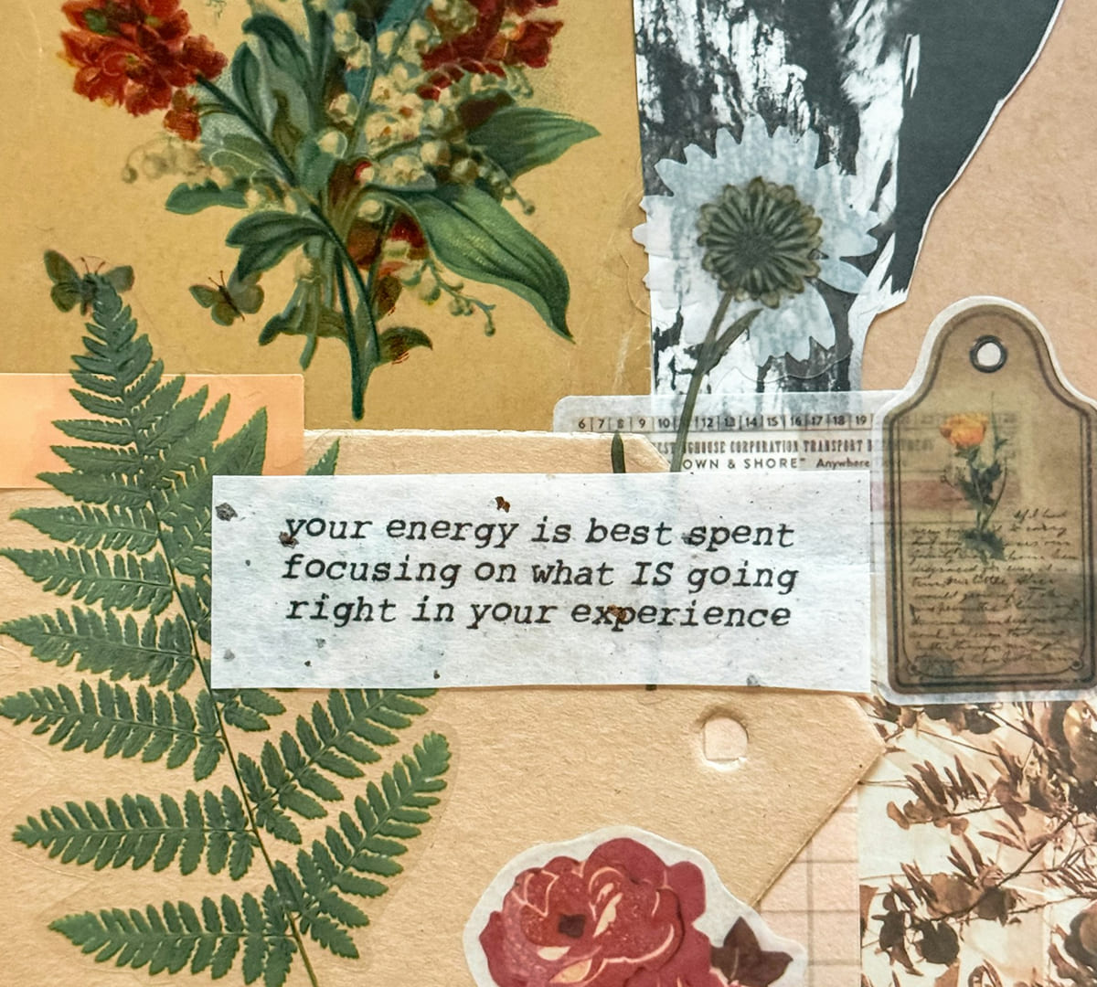
Three signals a brand is winning against AI slop:
We shipped Elan's website with a heavy AI-vibe-coded workflow, and the reason it lands is *not* that it looks generated. It looks considered. AI was leverage, not aesthetic.
If you want the tactical layer, we broke down our workflow in A Designer's Guide to AI: 7 Strategic Prompt Hacks and stress-tested the tools we lean on most in Claude or Figma Make? Showdown For Designers & Founders In 2026.
AI made polished cheap. So polished stopped being valuable. The premium moved to human residue: the stuff that reads as a human made this.
You can spot AI visuals instantly now. Recent industry data suggests roughly 73% of consumers say they can identify AI-generated content on sight, and rate it as less credible than human-made work.

This mirrors what we're seeing across the wider product-design world, which we wrote about in UX Design Trends Reshaping Digital Products: calm interfaces, AI-native but restrained, performance over polish.
We've started actively pushing back on clients asking for "cleaner" or "more premium" when what they actually need is more human.
Strip the tooling debate away and this is the whole game.
Brand exists to compress a stranger's decision from "who is this?" to "I trust these people". Nothing about AI changes that equation. It just changes what generates the trust signal.
Pre-AI, polish was a trust signal because polish was expensive. Post-AI, polish is a trust anti-signal because polish is free and everyone has it. The signals now are specificity, taste, point of view, provenance. The stuff that's hard to fake.

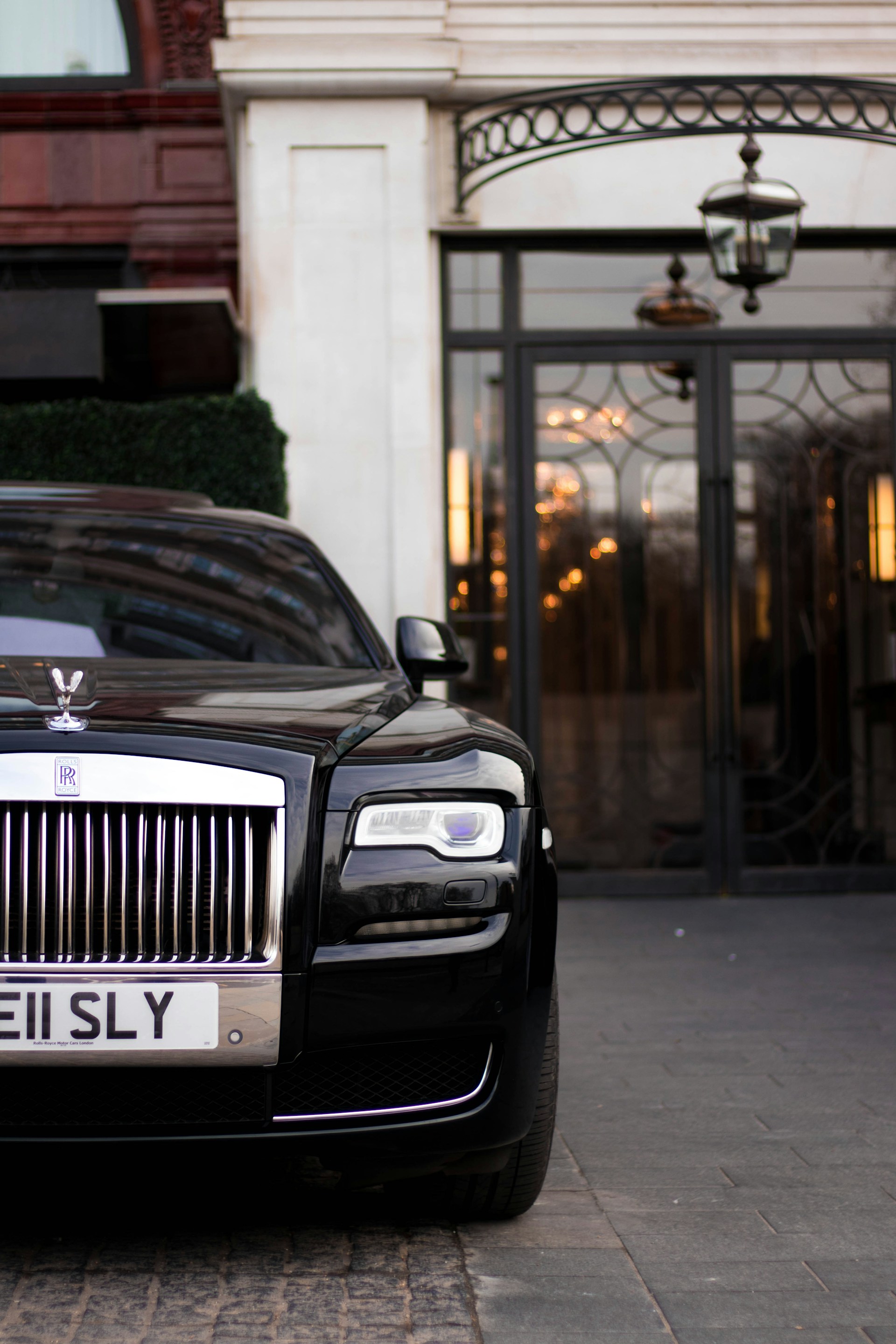
You feel this hardest in categories where trust is the product:
AI could not have produced any of these briefs. The work wasn't visual. It was human.
The studios and brands that get this are going to be fine. The ones optimising for the next AI feature drop are going to keep chasing something that just got commoditised.
An adaptive brand system is a modern identity framework where the core visual assets, logo, typography and colour, are designed as context-aware variations rather than a single fixed mark. It allows the brand to hold together across favicons, app icons, motion, dark mode, print and campaign work without breaking.
Generative models are trained on the statistical average of everything that came before them, so their outputs collapse toward the safest, most common patterns: Inter type, centred hero sections, purple gradients, symmetrical marks. Without strong human direction, AI produces the mean of existing design, which is by definition unremarkable.
Yes, more than ever. AI compresses the execution layer but not the strategy, taste, judgement, or system architecture layers. Founders who ship AI-only brands end up looking indistinguishable from every other founder who did the same thing, which is now the fastest way to become invisible.
The anti-AI aesthetic is a growing 2026 trend where brands intentionally add grain, imperfection, hand-drawn elements, real photography and asymmetrical layouts to signal that a human made the work. It's a reaction against the too-smooth, too-centred look that generative tools default to.
Start with an adaptive system, not a static mark. Use AI aggressively for exploration and speed, but hire a studio for the direction, taste and architecture. Prioritise trust signals over surface polish. The bar for looking generic just dropped, which means the payoff for not looking generic just went up.
Supercharged Studio is a creative technology agency that crafts websites, apps, logos, and brands. We help emerging innovators, industry leaders, hustlers, and dreamers create a competitive edge through design.
Your ideas will like it here.



.jpg)
