
Most brand identity problems build quietly. Here are 7 mistakes we see in every client brief, from early-stage startups to growing brands, and how to fix them.
Most brand identity problems don't announce themselves.
They don't show up on launch day. They appear six months later, when nothing feels connected. When every campaign starts from scratch. When you've updated the logo twice and still can't figure out why the brand doesn't land.
At Supercharged Studio, we've built brand systems for founders across wealth management, immigration law, tech, and global conferences. The same patterns come up every time. The mistakes aren't random. They're predictable. And once you know what to look for, they're fixable.
Here are the seven brand identity mistakes we see most often, and what to do instead.
This is the most common brand identity mistake we see, and it's easy to understand why it happens.
The logo is the most visible thing. It gets printed, pinned, shared. So when founders think "brand identity," the logo is the whole brief. All the budget, all the thinking, all the revisions go into one mark.
The problem surfaces the moment it's applied.
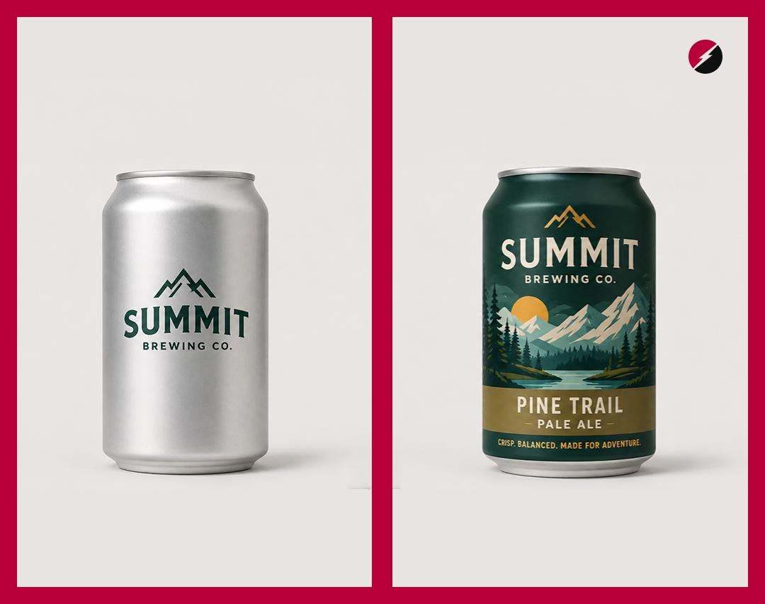
Without a colour system, a typography hierarchy, an imagery style, and a defined tone of voice, even a beautifully designed logo starts to feel inconsistent. Different colours on different platforms. Different fonts in every deck. Different energy in every campaign. The mark becomes a face with no personality behind it.
We built a full brand identity for DataSays, a chat-based business intelligence platform, in one week. The logo was only one output. Behind it was a complete system: colour palette with usage rules, two typefaces and how to pair them, voice guidelines, and an application framework. Without that system, the logo would have been meaningless in context.
The fix: Brief a brand project as a system, not a logo. The mark is one piece. The brand is everything around it.
It almost always starts the same way.
Two strong colours at launch. Then a campaign needs something fresher. A social post needs something to pop. A seasonal promotion brings in a new accent. A new designer joins and adds their own touch.
Before long, the palette is a collection, not a system.
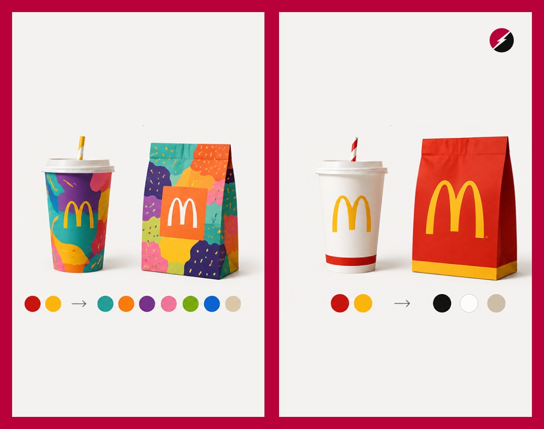
Colour is one of the most powerful recognition tools a brand has. The strongest brands are identified before you even see their logo. That recognition doesn't happen by accident. It's the result of disciplined, consistent colour application over time.
For Elan Global Wealth, an NRI wealth management firm, we built the palette around four specific choices: ink blue, ivory, charcoal, and a metallic bronze accent nodding to Indian heritage. Every colour had a defined role. The bronze, for example, was strictly an accent — never a dominant colour, never used in body copy. That discipline is what makes a palette feel like a brand, not a moodboard.
The fix: Define primary, secondary, and accent with usage rules for each. Every colour should have a clear answer to: what does it communicate, where does it live, and where does it not?
When most founders hear "brand identity," they think visual.
Brand identity is also how the brand speaks. The words it chooses, the tone it writes in, the way it shows up in captions, emails, decks, sales calls, and customer support. These aren't copywriting decisions. They're identity decisions.
We've seen brands with genuinely beautiful visual systems that still feel forgettable, because the moment someone reads the copy, it could belong to any company in the category. Neutral. Hedging. No perspective, no character.
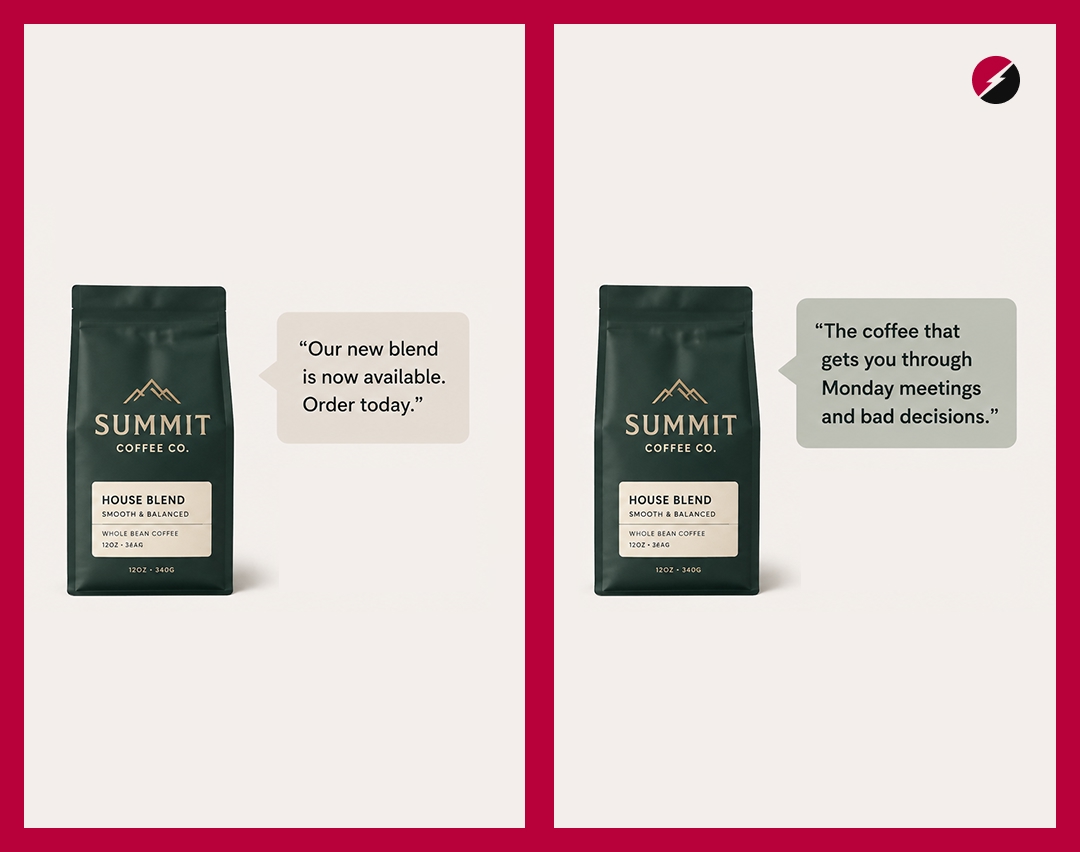
The voice should carry the same personality as the visuals. For the EB-5 Visa Investors brand, the visual identity was confident and authoritative — strong navy, structured typography, a bold geometric mark. So the copy had to match: direct, reassuring, never bureaucratic. The two had to be in the same room, not on different floors.
The fix: Define brand voice as part of the identity deliverable. Three to four voice characteristics with real written examples of what they look like in practice, and what the brand would never say.
Typography is one of the fastest ways to make a brand feel considered. Or completely chaotic.
When different designers, freelancers, and teams work from no shared type guidelines, the accumulation is quiet. One deck uses a bold serif. Another uses a geometric sans. A social post uses a display font because it felt right. A landing page pulls something from Google Fonts because it was available.
Each decision looks fine in isolation. Together, they build no visual memory. There's nothing consistent for someone to recognise.
Fewer typefaces almost always create stronger identities. One primary typeface, used consistently across every brand touchpoint, does more for recognition than four carefully chosen ones applied inconsistently.
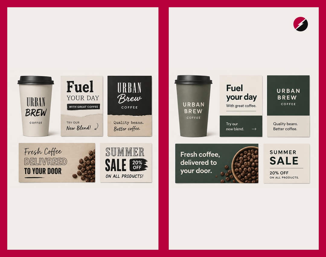
Typography is part of the brand's personality, not decoration. A tall, condensed typeface reads differently to an open, rounded one. Those signals should be intentional.
The fix: Define a primary typeface for headlines and a secondary for body copy, with documented scale, weight, and spacing rules. Every person creating for the brand should be working from the same type system.
This one is subtle, because it feels like the safe choice.
When a brand tries to appeal to everyone, it ends up connecting with no one deeply. The visuals become palatable. The language becomes neutral. The personality gets sanded down until the brand is inoffensive, forgettable, and invisible in a crowded feed.
The brands that cut through did so by choosing an audience and designing directly for them.
For the Shenzhen SEO Conference, the brand needed to speak to a specific audience: global technical professionals bridging the cultures of the East and West. That precision shaped everything: the imagery, the typography choice, the way the brand balanced Eastern and Western visual conventions. A generic "conference brand" would have missed every single one of those people.
The fix: Before any visual decisions are made, define your audience with enough specificity that you could describe one person. Design for that person, not for the category.
This is the mistake that catches founders off-guard, because it's invisible until the team starts to grow.
When one designer builds the whole brand, consistency survives through their memory alone. They know the colours, the fonts, the rules. They're the living brand guide.
The moment a freelancer joins for a campaign, or a second designer is hired, or an agency is brought in for a launch, that consistency disappears. Not because anyone did anything wrong. Because there's nothing written down.
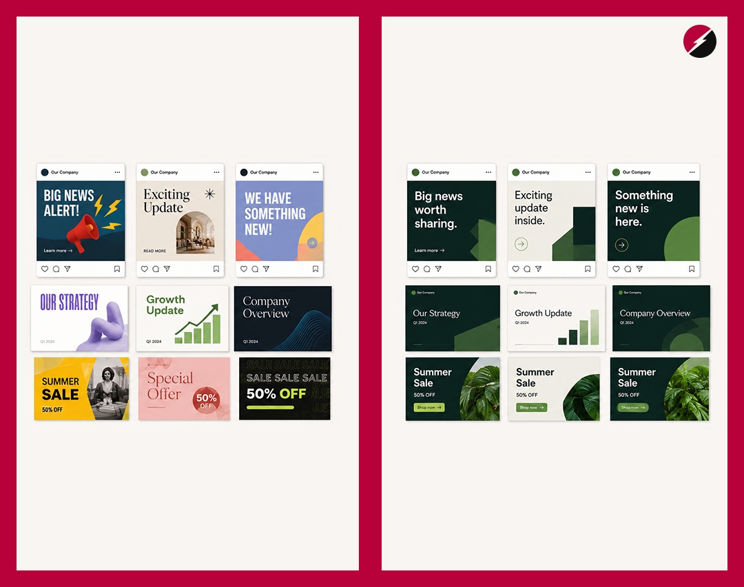
Every designer interprets the brand differently. Nothing looks technically wrong. Nothing looks connected either.
The result: every project becomes a new creative problem. Every social post starts from a blank canvas. Every campaign reinvents something that should already be built. A strong identity makes creation faster and easier. Guidelines are what turn a brand from a one-time output into a reusable system.
The fix: Build brand guidelines as a deliverable, not an afterthought. A single well-structured document covering colour, typography, logo usage, imagery style, and voice is enough to align everyone who ever touches the brand.
This is the mistake that happens after everything else goes right.
A strong brand system gets built. The guidelines are documented. The launch looks great. Then the brand gets applied for six months, the market shifts, the product evolves, a new audience shows up. And nobody touches the brand system because "we already did that."
Brand identity isn't a one-time output. It's a living system that needs to be tended.
The visual identity you launch with should be able to grow. The voice you define at the start should evolve as the company's personality develops. The guidelines you write should be reviewed as the team scales. The brands that stay relevant aren't the ones that got it right once. They're the ones that kept the system current.
The fix: Build in a brand review as a scheduled business activity, not a reactive one. Every 12 to 18 months, evaluate whether the identity still accurately represents where the company is headed.
Every one of these brand identity mistakes points to the same underlying issue: the brand was built as a collection of individual decisions rather than a coherent system.
A logo here. A colour there. A font that felt right. A tone that was never defined.
The brands that feel genuinely strong, the ones you recognise before you see the name, were built with the whole picture in mind. The logo exists within the system. The system exists to serve the strategy. The strategy exists to serve a specific audience.
That's what a brand identity system is supposed to do: not just look good at launch, but make every future touchpoint faster, easier, and more recognisably yours.
Use this to audit your brand before your next campaign.
If you answered no to three or more of these, there's likely a system problem underneath.
What is the most common brand identity mistake?
Relying on the logo alone. Most founders put all their brand investment into a single mark without building the colour, typography, voice, and imagery system that makes it work in context.
How do I know if my brand has an identity problem?
Look at your last five brand touchpoints side by side. If a stranger couldn't tell they came from the same brand, you have a consistency problem. If they all feel different in tone, you have a voice problem. If the colours shift across them, you have a system problem.
What should a brand identity system include?
At minimum: logo and usage rules, colour palette with defined roles, typography scale and pairing, tone of voice guidelines, and an imagery direction. For early-stage brands, a one-week sprint can deliver all of this.
How long does it take to fix brand identity mistakes?
Depends on scope. A full rebrand can take months. A focused brand sprint like the Minimum Viable Brand program we run at Supercharged Studio delivers a complete system in one week, flat rate.
Is brand identity only visual?
No. Brand identity is visual and verbal. The way a brand speaks is as much a part of its identity as the way it looks. Founders who invest in visuals but neglect voice end up with beautiful brands that still feel forgettable.
If any of these felt familiar, it's worth getting the system right before adding more to it. More campaigns, more content, and more visibility on top of an inconsistent foundation amplifies the problem rather than solving it.
At Supercharged Studio, we fix brand identity problems inside a one-week sprint: logo, colour, typography, voice, and guidelines delivered as a complete, usable system.
Supercharged Studio is a creative technology agency that crafts websites, apps, logos, and brands. We help emerging innovators, industry leaders, hustlers, and dreamers create a competitive edge through design.
Your ideas will like it here.



.jpg)
