Discover how Gen Z's nostalgic maximalist aesthetics are shaping brand and UX design trends in 2026, and what modern users truly value.
Every generation rewrites its design rules. And for Gen Z, it’s not minimalism, but about emotion and the need to be seen. Gen Z is growing up in a time of post-pandemic isolation, climate anxiety, and a rise of social media influencers, where they crave authenticity and belonging. The environment and political environment shape the way a generation believes is important and what they value.
For example, millennials preferred sleek, neutral interfaces, think like Apple and Airbnb designs. These seemed inspirational and efficient. But for Gen Z, they embrace the chaos and the colors because they prefer real designs over perfection. This is becoming more apparent and important because Gen Z is now making up over 30% of the working population and heavily influences global styles and decisions. It’s important to remember what values shape Gen Z design.
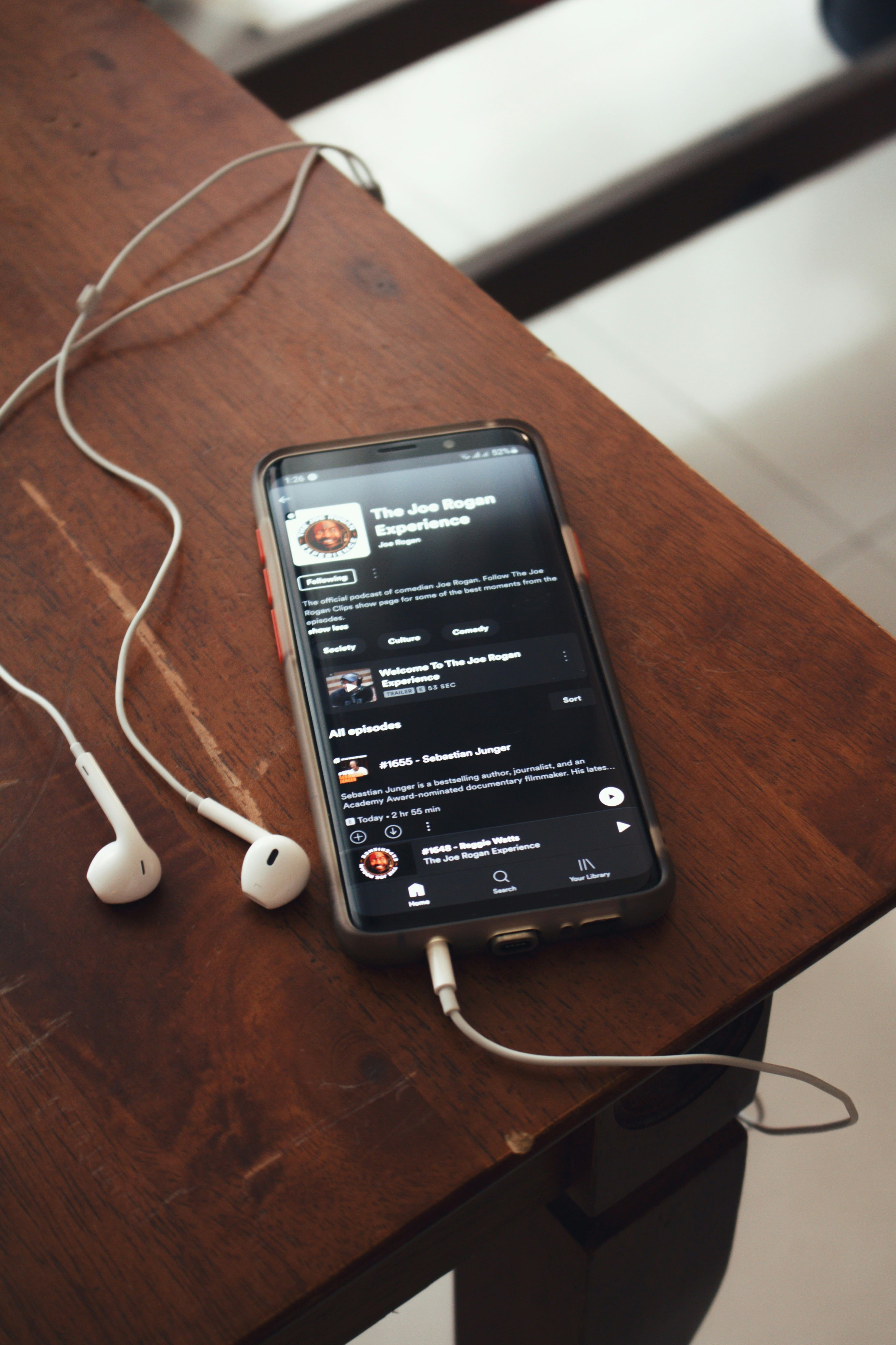
Gen Z has grown up with technology, and they have been interacting with mobile devices since they were toddlers. On average, they consume 7-8 hours of content every day, on TikTok and Instagram, where it has great visuals and creativity. Most Gen Z also prefer “fun and real” apps over those that feel "professional and serious”. This is important for designers to consider when creating their applications.
For a decade, Minimalism was king. Clean lines, negative space, and simplicity as a cure for digital noise. It was a communication strategy, telling the user: "We respect your time. Here is only what you need" (Nivit, 2025). Gen Z design is very different from the last generation: millennials. It’s very important to consider the values that make Gen Z consider emotional awareness and nostalgia. They prefer individuality over anything. In this article, I will explore how design is shaped by contrasting Gen Z and millennial design trends.
Millennial Design lasted from the years 2010 to 2018. These designs prioritized and lived by the saying “Less is more”. Millennials come from an age where there is post-recession, and there was a rise of startup optimism, which created a need for control in an unpredictable economy. This created anxiety about stability and success. After the age of digital clutter, such as the early 2000s retro design, millennials craved this clean aesthetic. They were longing for change from the cluttered designs and leaned more towards simple and stable websites. Some cultural influences included “digital detox trends,” which were becoming more common, and smartphones were becoming increasingly popular, and people longed for time away from their devices. There were also Big Tech companies like Apple, Google, and Facebook, which were using minimalist designs and paving the path for minimalism digital aesthetics to become mainstream. And, finally, there was also the birth of the smartphone era, which was demanding clarity and functionality. The society was recognizing efficiency and productivity.
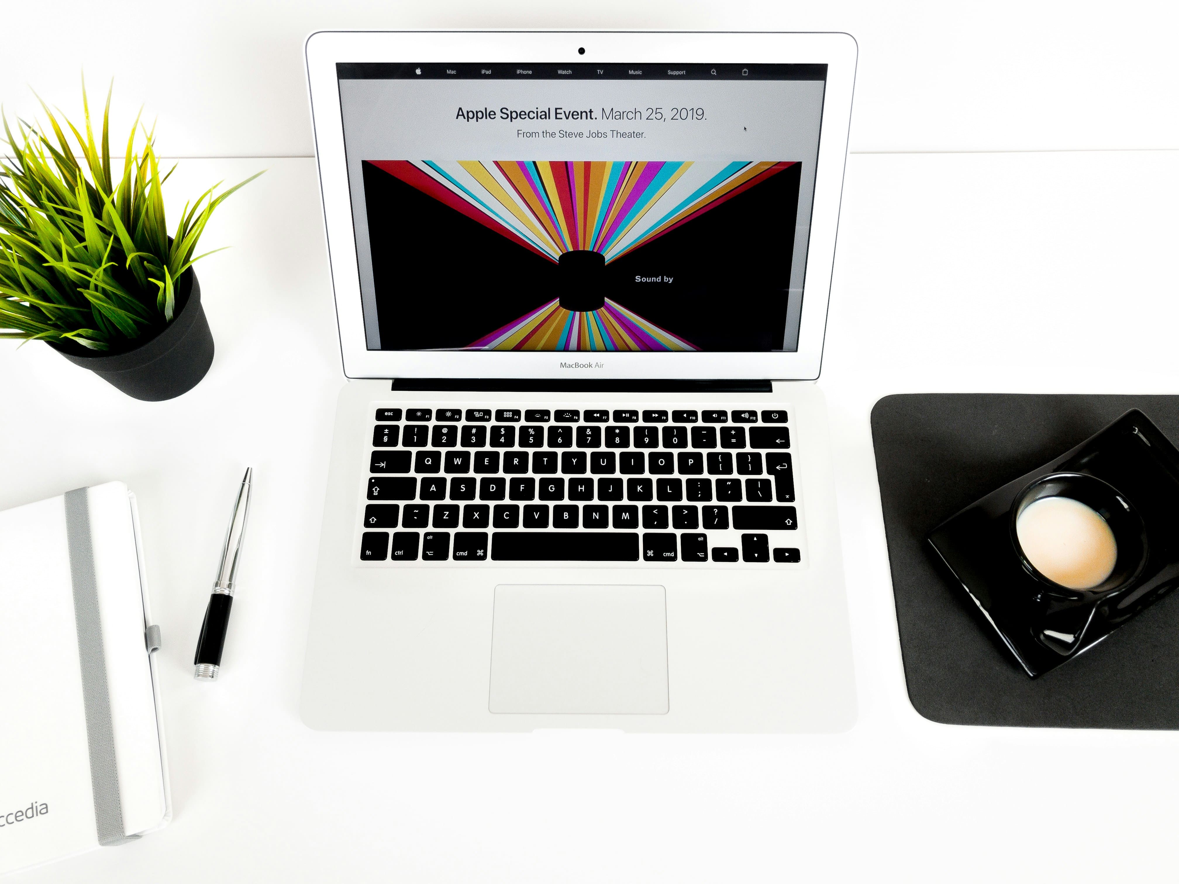
The design characteristics at that time were neutral palettes, mostly using whites, greys, and light pastels, which were calm and used minimal distractions. The typography mainly used was Helvetica and Roboto, which were globally accessible. The layout that was used is a strict grid, where order and professionalism. The UI interactions were minimal animations, which were micro-interactions that were subtle and purposeful.
Minimalism mirrored the millennial pursuit of order in uncertain times. The “flat design” movement symbolized transparency and trust, where nothing was hidden and everything was clear. There was visual calm, which was a subconscious response to overstimulation from the early internet. The designs that became the most popular were those where users looked polished. Minimalism also influenced architecture, from the fancy designs to simple and functional architecture. Architects who made minimalism architecture popular included Ludwig Mies van der Rohe and Tadao Ando. They believed in the “less is more” philosophy and created buildings that reflected that, focusing more on functionality rather than aesthetics. Globalization is also making a difference here, where minimalist design has been transcending different languages.

At that time, there was a collective digital identity that symbolized belonging to the modern world. Using minimalist tech like iPhones and MacBooks symbolized that you belonged to a higher-income family. The polished personal brand was the new social currency. Think like LinkedIn, aesthetics and brand became the visual language of success. There was a collective acceptance where conformity to clear design meant fitting into the professional culture. This resulted in the same uniformity across different brands, which all followed the same gradients, fonts, and iconography.
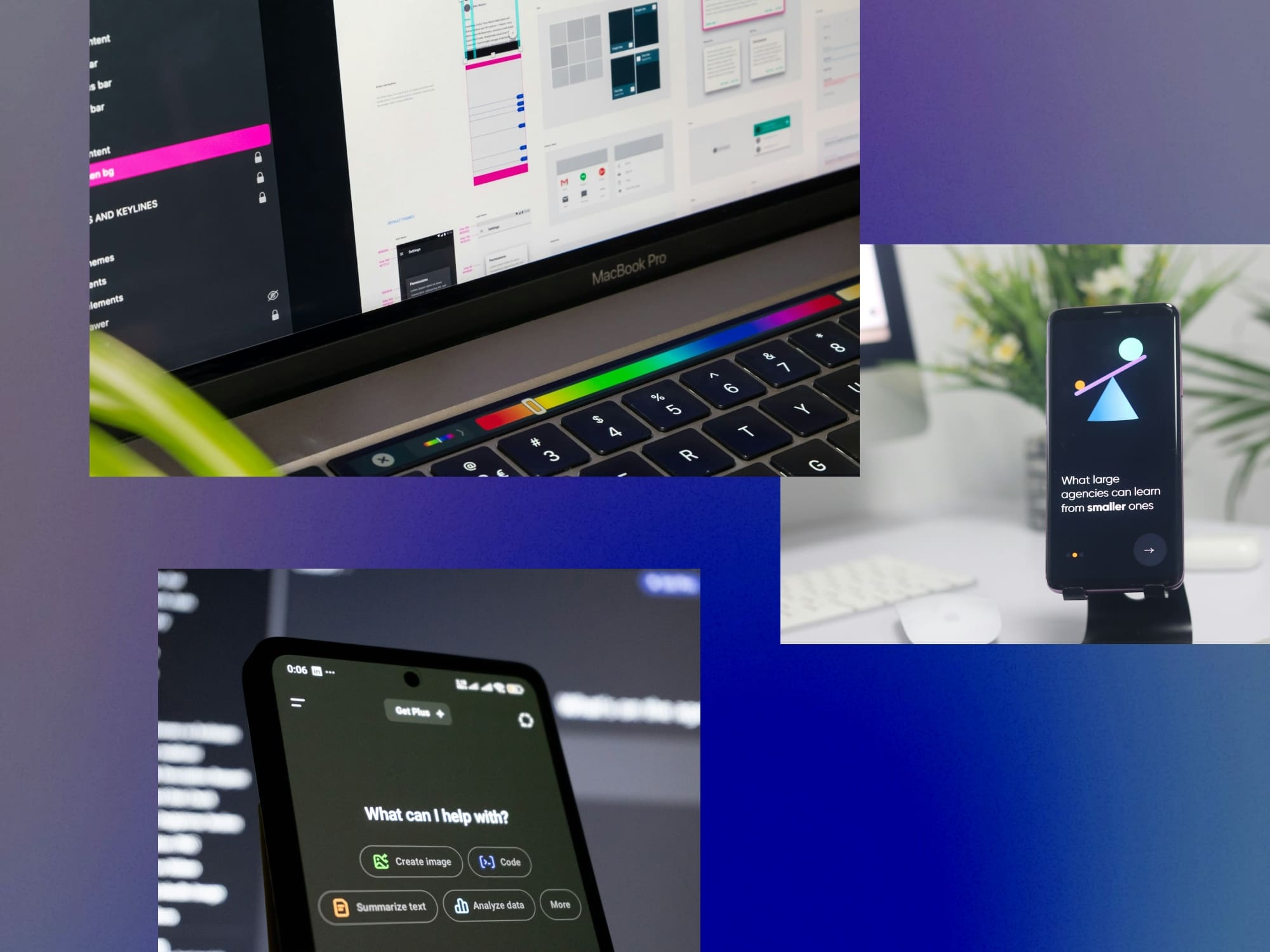
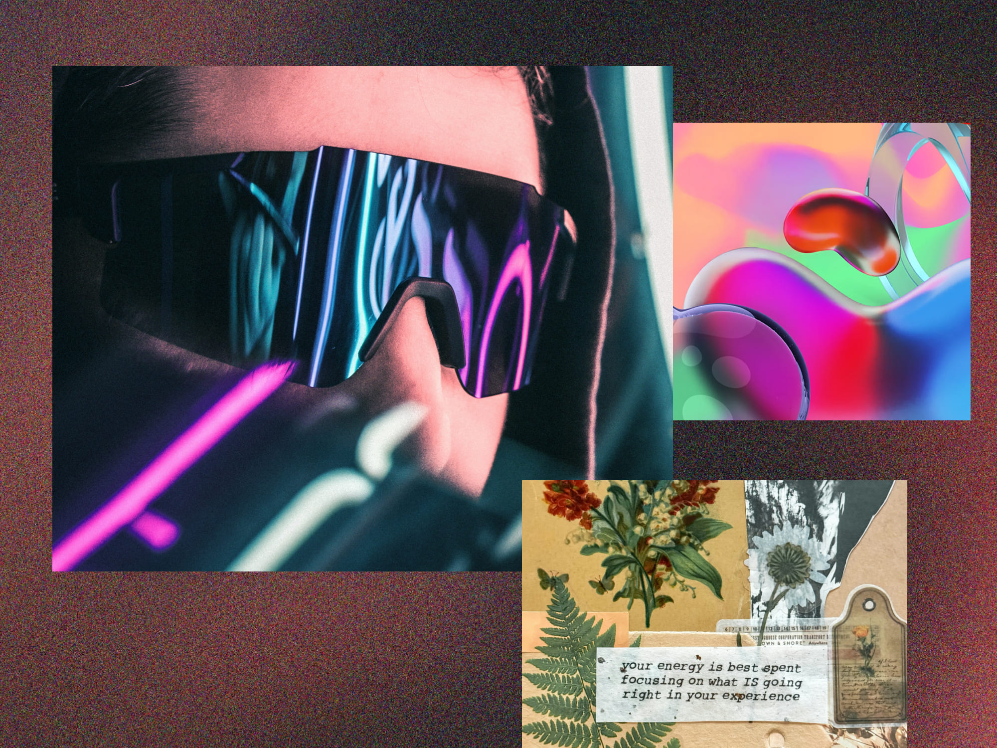
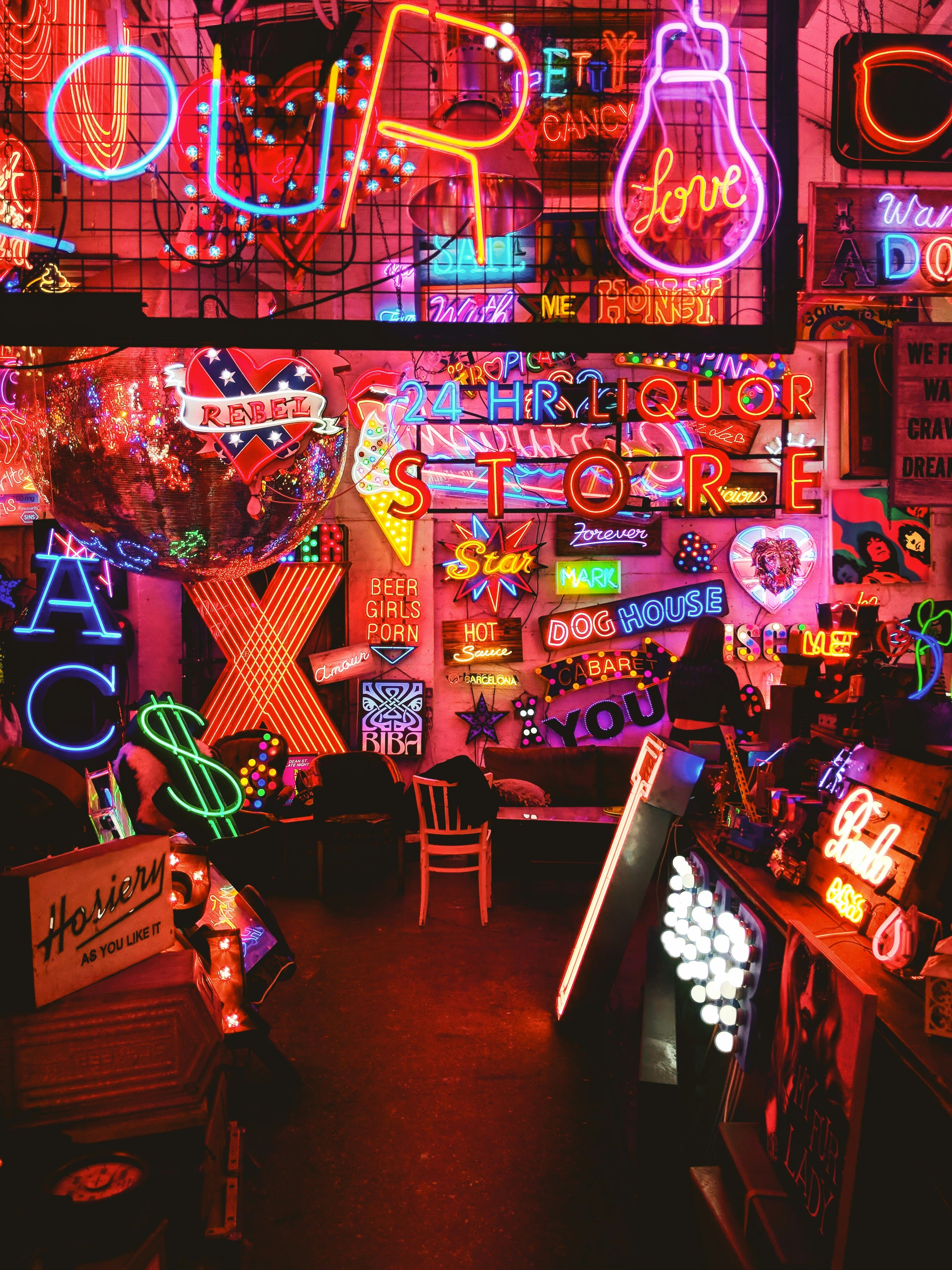
Gen Z grew up in a world of information overload and social fragmentation. They were raised alongside phones, personalized algorithmic TikTok, memes, and self-expression platforms, where they were design natives and not just consumers. Some of the things they faced were pandemic isolation, social justice movements, and algorithmic personalizations. They long for connection through authenticity, and they have a clear awareness of identity and representation. They are also accustomed to personalized experiences due to TikTok and Instagram’s For You Pages. Gen Z is also living in an unprecedented time of AI, filters, which makes them skeptical of anything that feels too “fake”, and they prefer designs that are created by humans. They can be messy, but raw. The recent photographs and texts written by AI make them well-educated in sensing if designs feel AI-generated, and they dislike that. Designs that embrace texture, chaos, and have signs of life are the ones that Gen Z feel the most connected with.
The design characteristics include aesthetic maximalism, which includes gradients and noise. They prefer chaotic designs over minimalist ones. The colors mainly used were saturated hues, neons, and mixed palettes. The typography was mixing fonts and retro text. They prefer expression over functionality.
Individuality is sacred, and users expect interfaces to reflect them, and customization is vital. Some examples of recent designs that do this really well are Spotify Wrapped, which the idea was developed by Jewel Ham. Spotify Wrapped had been around since 2016; however, it was sent as an email at the end of the year, but it took the internet by storm in 2019, when it came as a bite-sized storyboard in Spotify itself, and the internet could not stop raving about it. The intern was given a project to make Spotify Wrapped more relevant for Gen Z, and she delivered. Another social media app that might be Gen Z’s favourite app is TikTok. It’s personalized For You Page (FYP, shopping assistance, and a place to connect make it one of the most important apps for marketers and designers to increase branding for their products. Many Gen Z actually turn to TikTok before buying a new product, relying on reviews from other TikTokers. They will trust reviews from people on TikTok, which feel more credible than billboards or advertisements.
Digital spaces are mirrors of personality and not neutral tools for Gen Z. There are places where they can feel like they belong, based on shared aesthetics that defy subcultures. On the internet, there are aesthetic tribes that form their visual identity across platforms.
In modern UX now extends beyond usability into emotional identity. Design decisions determine who feels seen and who feels excluded. So, with Gen Z growing up with social activism, Gen Z expects designs to feel real rather than feeling inauthentic. Some social movement that Gen Z has been brought up living in is Black Lives Matter, LGBTQ+ inclusion, and mental health awareness. This shapes the wya that Gen Z feels about inclusion in the designs. Another thing that Gen Z dislikes is inauthentic or performative inclusivity. Performativity inclusivity means when a brand or product adopts the visual language of empathy, but doesn't back it up in company behavior. It’s often very surface-level, where it is adopted after the real product is already built. Some examples of inauthentic inclusivity are when banks or fintech sites show “diverse” stock imagery on their homepage, yet their apps are usually only showing English functionality, or lack accessibility features.

Since Gen Z has grown up surrounded by social media, they are very quick to detect true authenticity and true inclusivity. So brands have to represent true actions, not only showing inclusivity within their logos, and not representing over-polished designs, since those break trust automatically.
Gen Z also expects emotional accessibility, where tone, humor, and diversity matter as much as the function. Users feel at home where design reflects their lived realities, which is inclusive UX that signals psychological safety. Examples included Figma’s customizable cursors, Canva’s AI templates, and Duolingo's character redesigns. Duolingo's playful messages in the middle of learning make it feel more human. Some of the older UX error messages included Error 404 or invalid password. Also, many Gen Z products use memes or pop-culture tones because this makes the interface feel more alive. This also ties into Don Norman’s emotional design theory, where good design evokes positive emotion because people perform better when they feel good.

Another thing is that Gen Z has grown up with personalizing apps. It’s not just about aesthetics, but it's about how individuals are respected. Things that newer apps have to have are choosing pronouns, designing your avatar, and picking color themes. Some examples are that Slack allows users to set custom status emojis and pronouns. Pinterest allows home feeds based on mood and interest. Thai connects to psychological safety, which describes when people feel represented, they are more likely to be trusting of a platform. This also connects with Maslow’s hierarchy of needs, where users feel self-actualized when they have their belonging and esteem needs.
Every generation reacts to the design aesthetics of the one before it. Gen Alpha is growing up with hyper-saturated digital environments where they may crave simplicity and slowness. The predicted traits are that minimalism returns, but with some more emotional intelligence. Since they grew up with Artificial Intelligence, they would want it to be human-centered. The expected designs blend millennial order with Gen Z emotions.
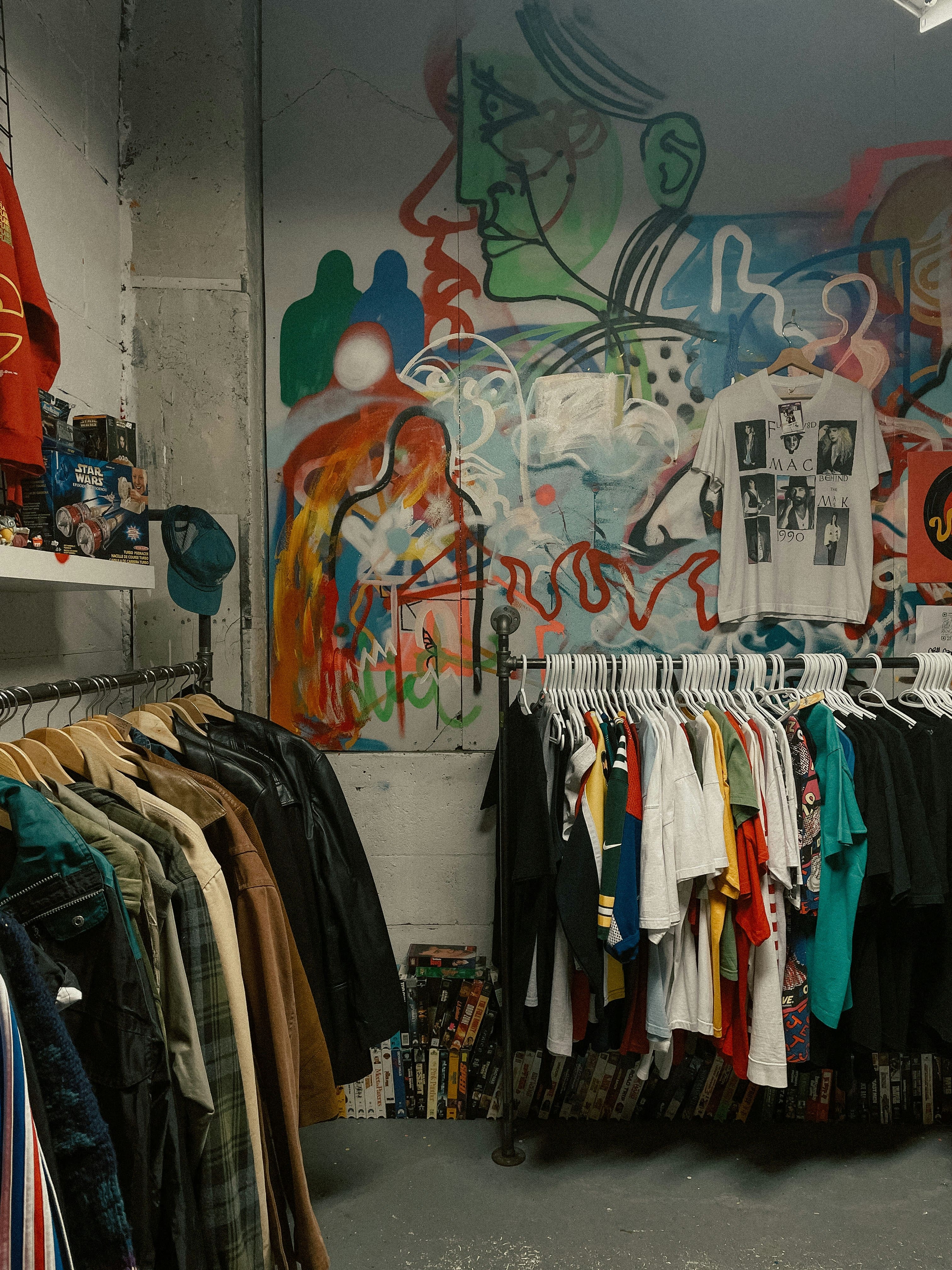
Design is very similar to fashion trends in the way they are cyclic. In the early 2000’s the fashion industry was thriving by producing baggy jeans. However, later on in the mid-to-late 2000s, skinny jeans became popular. Now, we can see the fashion trend is back for baggy jeans. This is the same case with design as well. Retro design was very popular in the early 19’s. But then the millennials disliked any retro or maximalist trends, and instead leaned into the minimalist style. Now, Gen Z really prefers the retro style and feels nostalgic about those years. This is why they say that you should never throw out your clothes. Because you never know when the fashion trends will recycle and come back and become trendy. I would advise the same for designers. Never throw out your designs. You never know when that “old style” will become aesthetic again.
Supercharged Studio is a creative technology agency that crafts websites, apps, logos, and brands. We help emerging innovators, industry leaders, hustlers, and dreamers create a competitive edge through design.
Your ideas will like it here.