Discover the theory of designing professional logos using tactics like spacing, the golden ratio, geometry, storytelling, balance, and more.
Have you ever wondered why some logos just feel “perfect”, while others have something missing in them? Those logos don’t just randomly get lucky, but they have special thought behind them. Many people assume that great logo design “just looks right,” but there’s actually math behind it. Designers use circles, lines, and ratios to create harmony between the logos. Behind every great logo design, like Apple, Pepsi, or Microsoft, there lies invisible math. This geometry creates symmetry, balance, and proportion, which makes our brains see the logo as perfect. These ratios that are perfectly designed in logos are the same found in human faces as well.

Logo design is both an art and a science. It’s about great storytelling and also having a mathematical structure. Professional designers understand that good logo design is not just about flawless alignment, but it's also about the balance between proportion and a good concept. At Supercharged design studio, designers use this two-step process when they begin designing their logos, where they start with a concept, with a story, and then transition into alignment and grids. Every logo is built to work across different scales and to align with the purpose of the brand.
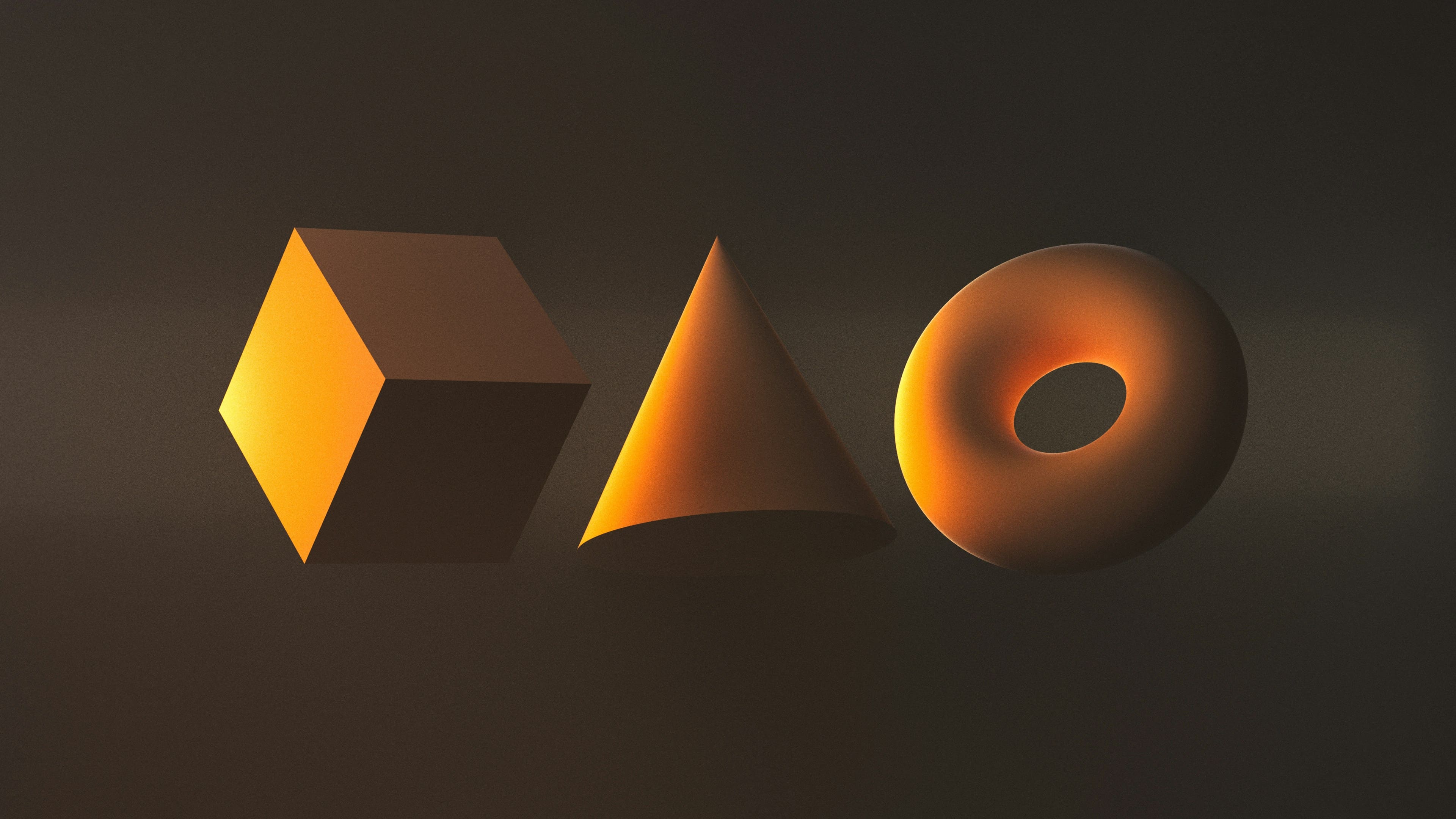
Basic shapes like squares, circles, and rectangles all form the universal basic design. Each of these shapes has symbolic and functional meanings. For example, circles represent harmony and community. They have no beginning or end, they just go around, which conveys trust. They are also associated with safety, very commonly used in tech and social apps. Some common examples of design logos using circles are Pepsi and Target. Triangles represent strength and stability when they are designed standing upright, or dynamicness, which is when they are tilted. The pointed edges signal direction, and some common examples are Adidas and Google Drive. These sides all represent different directions, such as with Google Drive, the triangle is built from three colors, which represent collaboration and balance. Squares and rectangles symbolize structure and reliability. They are associated with professionalism and order. For example, Microsoft’s four squares represent a window into the digital world.
Our brains are wired to see order. Humans perceive order as wholes, not fragments. The mind automatically seeks structure, which means harmony feels satisfying. Gestalt principles show how our brains seek structure, which is where equal sides in shapes signal to users stability. Geometric consistency in design uses these instincts to build trust. Designers can use this to their advantage, where if they mirror elements, and the more “organized” a logo feels, then users can recognize and remember it.
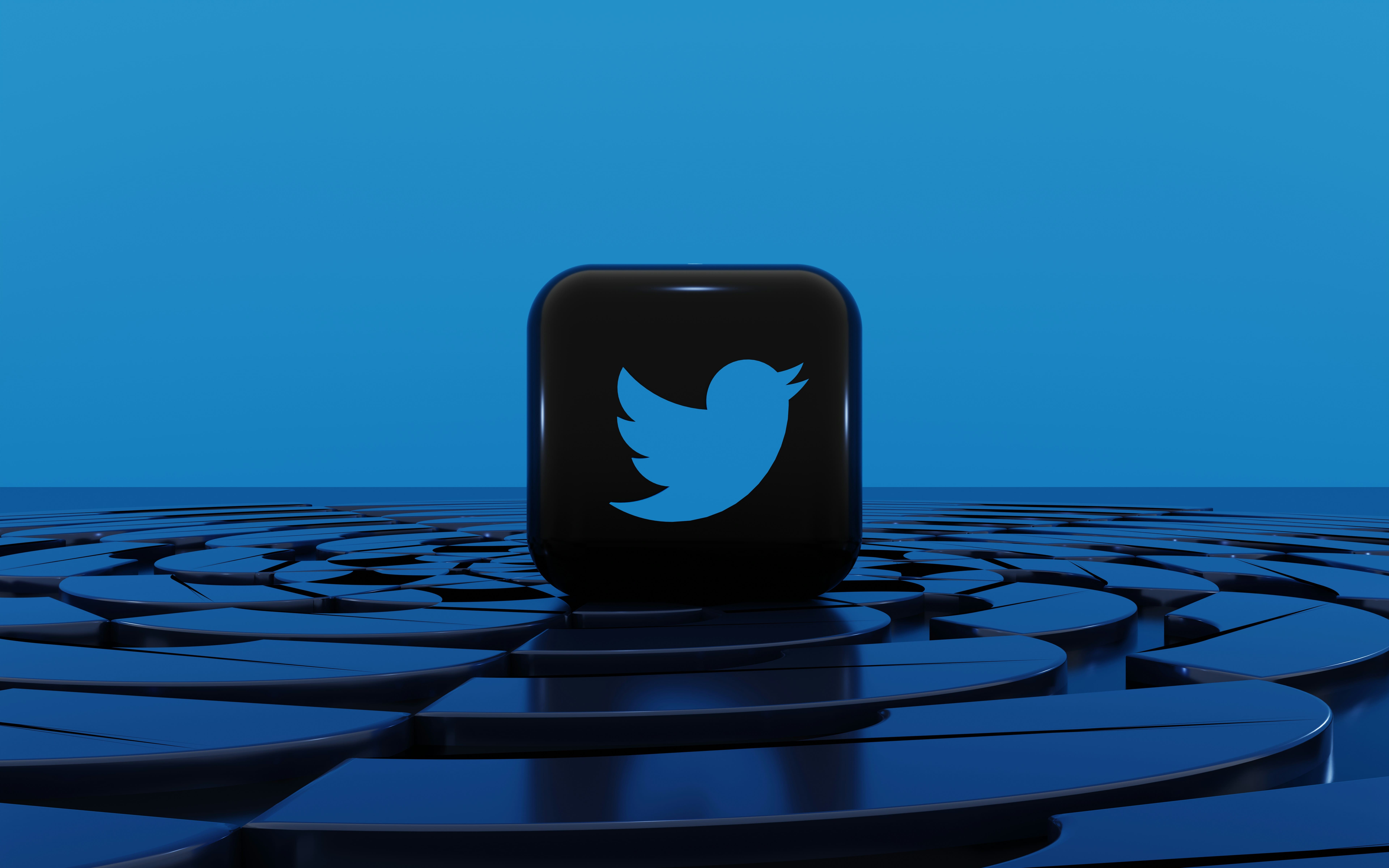
Grids are the backbone of logo design. They ensure that all objects are aligned correctly and proportional. These grids define placement and spacing between elements. They provide consistency in response design across brand applications like billboards and app icons. They are used to allow predictable relationships between logo parts. Some modern examples, like the Twitter bird, are built with overlapping circular grids. This ensures scalability across different screens and gives a professional polish.
The golden ratio is a mathematical ratio that appears in nature, such as in shelves, leaves, and galaxies. Humans will subconsciously perceive it as “balanced”. This has been used in the classical arts since Da Vinci's art, which has now been adopted in design.
This defines relationships between lengths, heights, and curves. Some logos that use the Golden ratio are Apple, which uses a circle that follows the Fibonacci sequence, and Pepsi, which has the arc built based on the ratio between the circle diameters. These ratios can make the logos feel organic, and when users see the logos, they feel they are “right”.

Too much accuracy can look “weird” and feel “perfect” to the human eye. Designers must use optical correction, which means breaking geometric rules to look correct. Curves can appear thinner than straight lines, so designers can thicken them slightly.
Designers can intentionally “invoke” specific feelings using the help of geometry. Every visual adjustment can change how people feel about a brand. Designers are like psychologists, who can predict in some ways how users will feel about designs based on proportions and spacing. Symmetry signals trust to human brains, but slight asymmetry draws curiosity, which is why using it in balance is very beneficial to designers. There is a Japanese concept called Wabi-sabi that finds beauty in imperfection and simplicity. This concept is important in design as well because it shows how some imperfections can be celebrated and make a logo feel more real, which helps people connect to it. Some examples of logos that evoke friendliness, such as the YouTube app icon with its rounded corners, and in the same way, sharp angles can evoke strength, like Tesla. Designers also know when it's needed to deviate from mathematical designs, such as when uneven spacing can create rhythm.
Professional designers have years of experience under their belt, which differentiates them from other younger designers. Designers often present two versions to clients, which include the creative concept version and the mathematical version. This ensures that the final version includes both structure and a creative story.
“What separates a beginner logo designer and a professional one is the amount of time they spend. Beginners will become fixated on mathematical precision, but professionals understand that design is about a story to be told."
- Sava Jovanovic, Logo Design Lead
He shared that many of Supercharged’s logo projects start with the concept, and then go forward with a measurable version, which has grids, golden ratio circles, and spacing rules. These are microdecisions that most viewers will never notice, but they make the difference between a logo that feels staticky and one that feels alive.
There is a balance needed for rational appeals, such as to investors and clients, and also an emotional connection needed for users. Good logo design follows both of these sides, and both geometry and emotional connection are needed for designers to earn trust and keep it.
"Design without math is like writing without grammar. You can still create, but the structure won’t hold. Design is the tension between structure and disruption."
- Nivit Kochhar, Studio Lead
For a great logo that follows 5 rules, it is also always followed by breaking 1 too. Rigid grids can build trust, but also feel very static. Designers also intentionally introduce some tension, like curves or unexpected spacing, to make it more appealing to the eye. For example, Nike’s swoosh is not symmetrical, but it feels heavier to create some motion to the eye. This “perfect inspection” feels very human, which is especially important when designing for the Gen Z audience.
.jpeg)
Since Gen Z design trends are now changing the design space completely. These rounded corners, gentle gradients, and modular symmetry. Gen Z dislikes anything that feels “fake” and prefers “imperfect” and messy logos. Some geometry design trends that Gen Z designs prefer are rounded corners, curbed lines, and organized logos that feel very approachable. Since this generation grew up surrounded by technology, they crave designs that feel human and reliable in this modern digital world. Supercharged’s exploration into Gen Z design trends shows how this audience prefers nostalgic colour palettes and expressive designs, which come from values such as individuality.
To learn more about these design philosophoies shape Gen Z modern branding, read Supercharged’s design exploration of Gen Z Design Trends.
Geometry isn’t something that designers only add at the end of their projects, but it guides every decision from their first sketches. The first step for any logo design starts with a concept foundation. Designers will often meet with the clients to understand the brand's purpose and audience. They will then experiment with the keywords related to the brand to choose what visuals would be best to represent the brand. Then they will use different shapes to shape the emotion and psychology in their logo.
Designers will often start by sketching designs, which are mostly experimental and not perfect. This stage is mostly about conceptual flow, and not about mathematics at this stage. They will explore multiple different directions, collaborating with their logo designers and brainstorming visually. Designers will also analyze competitors and collect reference grids to ensure this uniqueness.
Once the concepts work visually, designers will then use ratios and proportions to map the logos to measure the angles and align edges. At this stage, these intuitive sketches become measurable systems. Each point, curve, and angle is analyzed to maintain visual balance. While geometry can help with visual flow, a great designer has good intuition to make the logo feel alive. Many professionals will use the Golden Ratio or modular grids to find a balance between elements so that the logo will feel mathematically perfect but also visually correct. This ensures that the logo is symmetrical and visually harmonious, and the logo resonates with both the human eye and human mind.
Designers will now test their logos across different scales, such as mobile icons, tablets, desktops, and billboards. The geometry will help them at this stage since it will ensure that proportions stay visually consistent across different scales. They will also check readability and visual weight balance on different backgrounds. The goal is that there is balance on any device, and that the logo feels right everywhere.
After all these refinements, designers will present two versions to clients: the creative logo and the geometric logo. This demonstrates that these logos are not created arbitrarily, but it was carefully designed. This math version is also part of the brand documentation. During a review, the team also tests how the logo interacts with the real-world environments. Such as testing on different app screens and sizes. The goal is to create a logo that feels perfect on every screen.
.jpeg)
Each geometric mathematical logo version always connects back to the original brand emotion. The spacing, shapes, and arcs all represent something. The viewer will never notice the geometry, but they will be able to feel it. This blueprint becomes a story of balance.
Designers are very similar to architects. Architects use proportion and geometry to build functional but beautiful pieces. Designers will use the same technique, creating logos that feel aesthetic but are highly mathematical and engineered.
Great logos work together because they blend mathematical precision and emotional storytelling. Geometry can help create balance and consistency across all sizes and platforms. Professional designers know their craft wel, and know when to follow the rules and when to break them for visual interest. In this day and age, Gen Z respond well to logos that feel authentic and slightly imperfect.
Geometry provides structure and balance. It ensures logos look consistent on every device, and triggers closer proportions and increases subconscious trust.
The Golden Ratio is a design technique found in nature and art. Designers use it to plan spacing and composition to create natural harmony
Yes. Sometimes logos can feel robotic when they have overly precise measurements. Great designers will often break symmetry with small imperfections to make the logo feel more human
Programs like Adobe, Figma, and Sketch now include grid and ratio tools, which let designers measure their designs while keeping their creativity.
Our brains can process proportions faster than random measurements. Balanced geometry reduces visual effort, which helps recall and recognition, and this is why some brands like Apple feel iconic.
Supercharged Studio is a creative technology agency that has created dozens of logos and brand identities for emerging innovators, industry leaders, startups, and small businesses.
Work with us. Your ideas will like it here.
Supercharged Studio is a creative technology agency that crafts websites, apps, logos, and brands. We help emerging innovators, industry leaders, hustlers, and dreamers create a competitive edge through design.
Your ideas will like it here.


.jpg)