Learn how to choose, pair, and use fonts like a pro. Design sharper websites, logos, and decks with confidence and style.
Picture this: you’ve poured blood, sweat, and tears into crafting the perfect story behind your brand. Hours spent meticulously reflecting on your personal journey and coming up with just the right words to define your vision, communicate your values, and outline your promise to potential customers. You’ve honed things down to the syllable. There isn’t a period out of place. You’re ready to share your story, but there’s just one thing left: showing it to people.
That’s where the power of typography comes in.

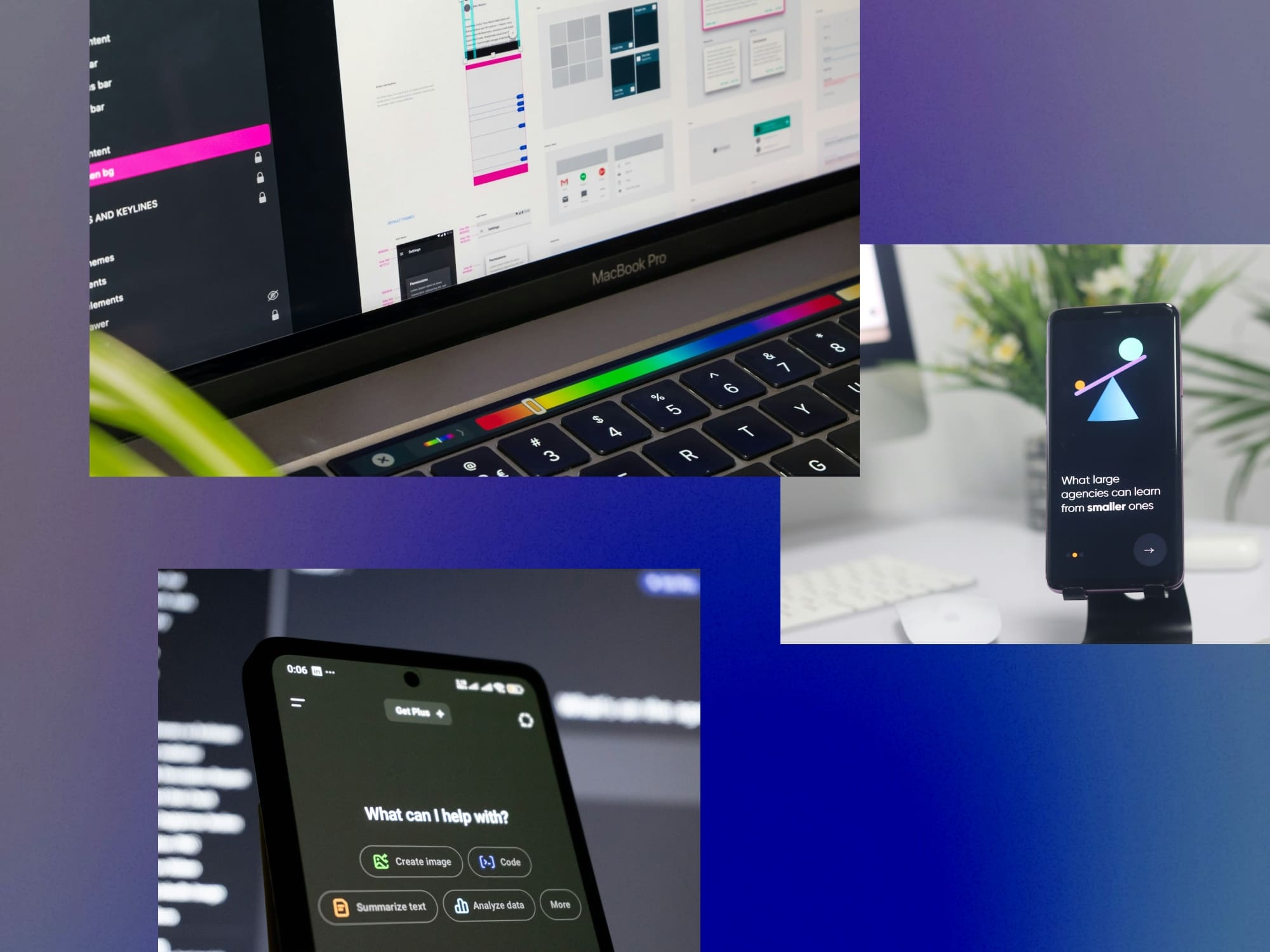
Simply put, typography is the visual art of positioning words in a way that represents your message and connects, both aesthetically and emotionally, with your audience. Think of the abstract marks that make up alphabets as the first representatives of your story. Their shape, size, colour, and placement all work hand-in-hand to deliver your message to your audience. Words are everywhere, and therefore can be overlooked, but good typography helps your words stand out to your audience. Whether that’s on a smartphone in the palm of their hand, or across a massive billboard floating in the sky.
Whether we know it or not, we’re constantly looking at letterforms all day, everyday. Every time we open our phone, or we fire up our computer to write an email; even when we sit down to relax with a book, or kick back and watch a movie with subtitles. Type is like water to fish, or air to us humans — invisible, but everywhere.
Our eyes consume oceans of information, both passively and actively. And, more often than not, type is the container for this information. But it is worth remembering that type isn’t just merely a container. With type, form and function go hand in hand. The way a typeface looks not only elicits an emotional response, but it also affects the tone of the text that it carries. Aesthetics are just as important as information.
If you’re itching to leverage the power of type but are unsure where to start, don’t worry, we’ve got you covered! This blog post covers all you need to get started on picking and pairing fonts like a pro. Dive into the topics listed below, and soon you’ll be on your way to understanding the art of typography!
[Quick note: if you really want to dive deep into the technicality of typography, check out our article Typography 101 For Designers: Terms, Anatomy, Principles, And Process]
There’s a vast world of type out there! When you’re looking for the perfect typefaces for your project, it is important to consider not only aesthetics, but also practicalities. Both are equally important, and often go hand in hand with each other. Ask yourself the following questions, and by the end, you’ll be a pro at finding the right typeface for every situation!

For most projects and businesses, there should be readily available typefaces to fit your needs. A skilled brand designer will be able to help you pick the right font for your brand.
However if you’re looking for something more custom to suit a very specific vision, custom typefaces can be uniquely tailored to your brand, but they take time to design and develop.
Want a custom solution but are short on time? Consider working with a type designer to modify a pre-existing typeface.
Comic sans for a lawyer is questionable. Comic sans for a preschool is delightful.
What I'm saying here is that fonts have personalities. The same logo can have a drastically different effect with a standard Helvetica, a old goofy Comic Sans and suave Montserrat.
Below are a few font properties you should consider when picking (or custom designing) one for your logo:

There’s a lot of variety even within one type style! Say you’re a tech startup looking for a sans serif for your logo. A clean, geometric sans might serve you better than a humanist sans with calligraphic flair.
It’s important to select a typeface that has some flexibility and diversity to it. Ideally for a base typeface, you should consider factors like multiple weights and italics.
However, for more in depth considerations, consider other aspects. Optical sizes. Proportional and lining numbers Multi-language support. Numbers. Sign characters (!@#$%).
Not every typeface needs to have every single feature! Prioritize the ones you need.
How a font is spaced is as important as its design! Bad spacing and kerning will take away from your message and make it look unprofessional.
Often overlooked, licensing is the final step in purchasing a typeface. Are you using the font for print? Maybe you need it for a website or app? Ensure you purchase the correct usage license.
Mixing and matching different typefaces is not only good for differentiating text, it also creates personality. With a successful type pairing, you’re aiming for the sweet spot between difference and similarity. If the two (or more) typefaces are too visually similar, they’ll blend into one another. Too different, and they’ll clash. To start pairing type, consider construction and height.
To pair typefaces based on construction, look at shapes of individual letterforms by typing out the same word in different fonts and studying the shapes of key letters. For example, is the ‘o’ rounded, squarish, or in-between? Are the ‘a’ and ‘g’ single-storey or double? Are the ends of letters like ‘e’,’s’, and ‘c’ chopped off at right angles or not? A similar construction is more important to ensuring harmonious pairing than details like contrast (the difference between the thickest and thinnest parts of a letter), and the type of serifs (or the lack thereof).

Next comes height. This one is simple — when placing two or more fonts together in a word or sentence, ensure that their x-heights match. This can be done by picking two fonts whose x-height is the same by default, or you can make one font size larger or smaller to match the other. Matching x-heights allows the eye to flow smoothly from one letter to another when reading, and can help connect radically different fonts. Finally, remember to have fun! Picking and pairing type is an art, not a strict science.

Want to set the perfect block of text? Here’s a handy checklist to help you set type like a pro. The goal of typography, first and foremost, is to make reading a pleasurable experience. By considering the following key concepts, you’ll delight your audiences with text that sparkles.
Let’s take a closer look at each of these concepts!
Placing type on a smartphone is different from doing so on a wheatpaste poster. In a word, it’s about size. Optical size, that is. Simply put, the smaller screen of a smartphone needs smaller type. In the days of lead type, glyphs had to be cut to specific sizes. Nowadays, digital typefaces are flexible and often contain variations of the font that are labelled “Banner”, “Headline”, “Display”, “Deck”, “Text” and more. These terms indicate the size at which the font is intended to be used. Make sure you’re using the right one for your canvas!

A grid is a typographer’s best friend. Dividing your canvas into a grid not only organizes space, it also establishes relationships between different objects on a canvas and allows information to flow smoothly. The type of grid you need will depend on your canvas. Typesetting a book? There are several layout grids (called canons) recommended specifically for books. Creating a website? You may need something like a 12-column responsive grid that is optimized for vertical scrolling and can scale to fit a desktop, tablet, or a smartphone.
A great reading experience is centred around the behaviour of the human eye. And the relationship between the eye and line length is fundamental to setting type. Let’s consider a simple one-column grid like you’d find in a book. The width of the column (along with font size) determines the amount of words that can fit in a line. If there are too few words in a line, reading feels disjointed as the eye has to hop from one line break to another. If there are too many, the eye loses track of the line it's on. An ideal measure is between 45 and 75 characters long.

A perfect block of text is not just about letters themselves, it is also about the space that surrounds them. This negative space comes in two flavours: letter space and line space. Let’s tackle letter space first. In most cases, if you’re using the right optical size of a professionally designed font that has good spacing, you won’t need to make any adjustments to the spaces between individual letters (called tracking). In some cases, if your text is rather small, you may need to open up the tracking. And if you are setting large type, you may need to tweak the tracking so the letters sit snugly. As always, it's about finding an even visual texture. (A pro tip: when adjusting tracking, avoid the “optical” option in your text editor and go with “metrics”. “Metrics” uses the spacing values specified by the font’s designer, “optical” uses the text editor’s algorithm).
With line spacing, you want to find the sweet spot where the eye flows smoothly from one line to another. Make sure that lines of text aren’t so close that they collide with each other, and that they aren’t so far away that the eye gets lost jumping from the end of one line to the start of the next.
Being a good typographer is all about directing a reader’s attention. Dividing text into headings, subheadings, and body text helps the reader scan information at a glance and digest it efficiently when reading. Establishing this hierarchy depends on three things: position, weight, and scale. Place a word at the top of a page and it automatically becomes the most important. Use the bold weight of a typeface and it instantly draws the eye. Make a word large compared to its neighbours and it stands out. Most of the time, creating hierarchy will require utilizing a mix of position, weight, and scale (and perhaps different fonts).
If type was purely a container for information, wouldn’t just one typeface be enough? Instead we have a cornucopia of type available to us at our fingertips. And type designers the world over are always crafting infinite variations of new letterforms. As someone who makes letters, I often ask myself, “why make more fonts?”
The answer to that question is the same as the answer to “why make more songs?”. Like music, type design is a way for us to communicate. As long as humans make music, there will be new songs. And as long as we write and read, we will draw new letters. It is an expression of being human. So next time you’re out walking and spot an interesting looking letterform, maybe stop for a second to appreciate its design and to consider the hands that lovingly crafted it.
On that note, I’m off to draw some letters and listen to some music. Thanks for reading!
Joshua Joel Anthony is a designer and typographer whose work explores the emotional depth of visual storytelling. He collaborates with Supercharged and other creative studios to help brands craft memorable, meaningful identities.
You can connect with Joshua and follow his work here: https://www.instagram.com/honeyantjosh
Supercharged Studio is a creative technology agency that crafts websites, apps, logos, and brands. We help emerging innovators, industry leaders, hustlers, and dreamers create a competitive edge through design.
Let us help you craft the next stage of your brand identity.
Supercharged Studio is a creative technology agency that crafts websites, apps, logos, and brands. We help emerging innovators, industry leaders, hustlers, and dreamers create a competitive edge through design.
Your ideas will like it here.