Build trust, stand out, and shape your brand's voice using typography. A must-read guide for founders and marketers serious about brand impact.
Picture this: you’ve poured blood, sweat, and tears into crafting the perfect story behind your brand. Hours spent meticulously reflecting on your personal journey and coming up with just the right words to define your vision, communicate your values, and outline your promise to potential customers. You’ve honed things down to the syllable. There isn’t a period out of place. You’re ready to share your story, but there’s just one thing left: showing it to people.
That’s where the power of typography comes in.

Simply put, typography is the visual art of positioning words in a way that represents your message and connects, both aesthetically and emotionally, with your audience. Think of the abstract marks that make up alphabets as the first representatives of your story. Their shape, size, colour, and placement all work hand-in-hand to deliver your message to your audience. Words are everywhere, and therefore can be overlooked, but good typography helps your words stand out to your audience. Whether that’s on a smartphone in the palm of their hand, or across a massive billboard floating in the sky.
Whether we know it or not, we’re constantly looking at letterforms all day, everyday. Every time we open our phone, or we fire up our computer to write an email; even when we sit down to relax with a book, or kick back and watch a movie with subtitles. Type is like water to fish, or air to us humans — invisible, but everywhere.
Our eyes consume oceans of information, both passively and actively. And, more often than not, type is the container for this information. But it is worth remembering that type isn’t just merely a container. With type, form and function go hand in hand. The way a typeface looks not only elicits an emotional response, but it also affects the tone of the text that it carries. Aesthetics are just as important as information.
If you’re itching to leverage the power of type but are unsure where to start, don’t worry, we’ve got you covered! This blog post covers all you need to get started and understand the power of type like a pro. Dive into the topics listed below, and soon you’ll be on your way to understanding the art of typography!
Choosing the right typeface for your brand begins with considering the context in which your words will be read. Brands within a certain sector often have typographic similarities that signal their alignment from the outset. Typographically speaking, fitting in is just as important as standing out. Establishing your brand’s alignment tells audiences what to expect and builds trust. After all, you wouldn’t want your cutting-edge tech startup to be confused with the hottest new restaurant in town!
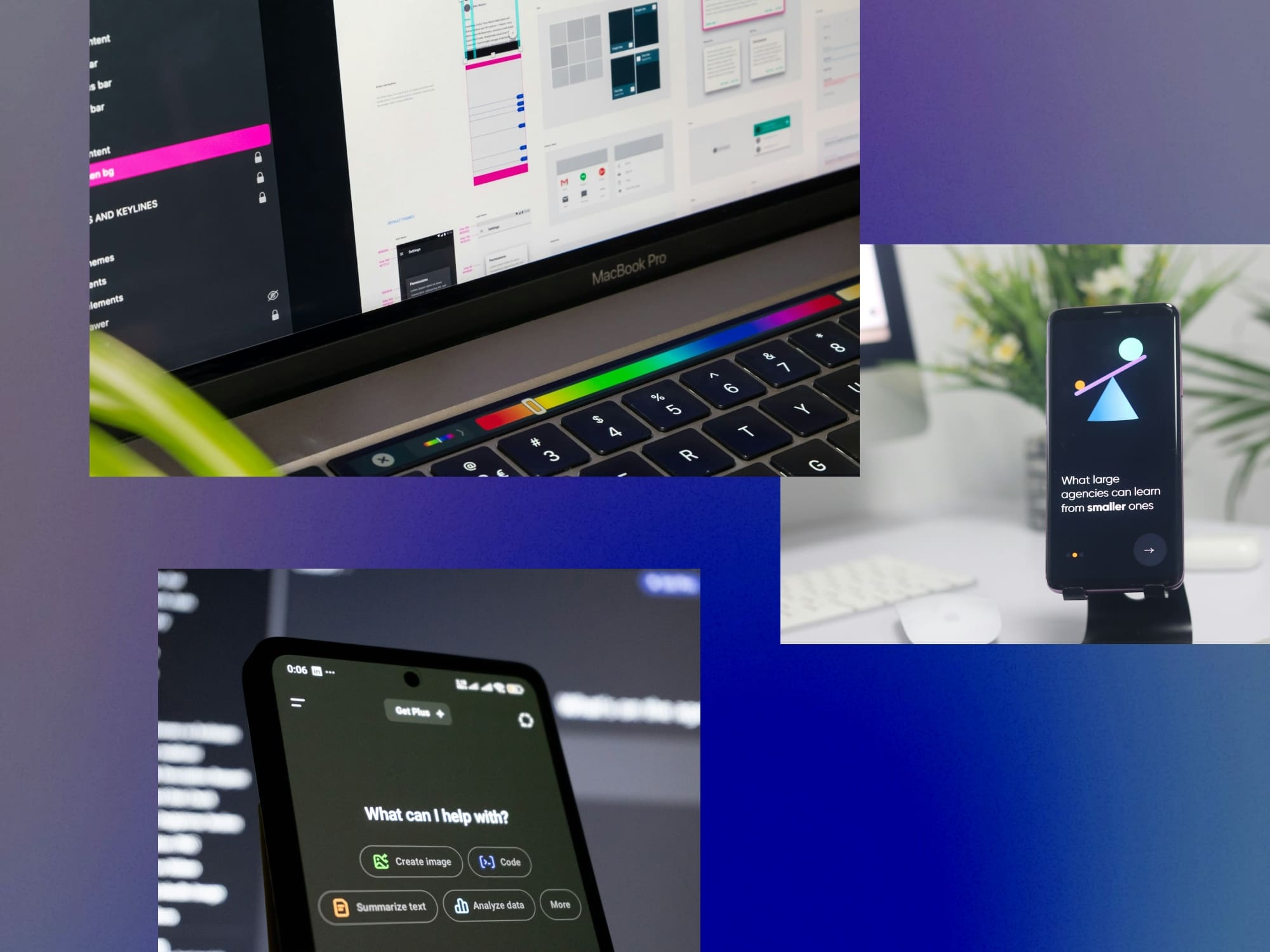
With UI it’s all about guiding the user from point A to B, and ensuring that their journey is as smooth as can be across all possible touchpoints. The flow of information is the priority, so you want to ensure that your typography focuses on legibility first and foremost. This means choosing the right optical size of type, ensuring that it has an ample amount of negative space around it, and that the colours selected for the type prioritize accessibility. Finally, in our day and age, brands are expected to exist across multiple touchpoints. Ensuring that a brand’s identity remains consistent across all of them requires responsive design, wherein typography and other elements scale to fit the touchpoint they’re being viewed on.
When you’re thinking about typography digitally, you’re mainly considering size, placement, colour, and rotation. But when it comes to print, you’re dealing with all of that, and also with texture. This added element allows for infinite typographic variation. You can emboss type, deboss type, apply foiling, use specialty inks and more! It’s also worth remembering that the substrate on which your type will go affects how your type looks. Matte paper, for example, absorbs ink and can make letters look thicker than they are, whereas glossy papers wont. To combat this, typefaces may contain “grades”. These special cuts of a typeface compensate for differences in letters that arise due to ink absorption on certain substrates.
Typography often plays a starring role in a film’s opening credits. The main title introduces audiences to the world they will inhabit for the next two hours, and the title’s tone hinges on the right typographic treatment. Think about how the razor sharp logotype of The Godfather, rendered in stark black-and-white, perfectly sets up the epic tale of ambition, family, and crime. What’s more, the main titles often contain credits listing top-billed cast, and getting the typographic placement right is absolutely essential as it can be part of the cast’s contract. Who knew good typography could be contractually obligated!
In our digital world, it is easy to think of type as black pixels on a white screen. The days of movable type, where each letter was cast into a block of lead or clay, seem like a distant dream. However, even in the 21st century, type shows up in several interesting ways beyond the screen. Your name on the inside of your partner’s wedding band? Laser-engraved type. Your favourite athlete’s number on the back of their jersey? Heat-transfer type. The numbers on your watch? Pad printed type (a process called tampography). These niche cases are reminders that type exists in many forms, and each form comes with its own unique design considerations and best practices!
There’s a vast world of type out there! When you’re looking for the perfect typefaces for your project, it is important to consider not only aesthetics, but also practicalities. Both are equally important, and often go hand in hand with each other. Ask yourself the following questions, and by the end, you’ll be a pro at finding the right typeface for every stuation!
[Quick note: if you really want to dive deep into the technicality of typography, check out our article Typography 101 For Designers: Terms, Anatomy, Principles, And Process]

For most projects and businesses, there should be readily available typefaces to fit your needs. A skilled brand designer will be able to help you pick the right font for your brand.
However if you’re looking for something more custom to suit a very specific vision, custom typefaces can be uniquely tailored to your brand, but they take time to design and develop.
Want a custom solution but are short on time? Consider working with a type designer to modify a pre-existing typeface.
Comic sans for a lawyer is questionable. Comic sans for a preschool is delightful.
What I'm saying here is that fonts have personalities. The same logo can have a drastically different effect with a standard Helvetica, a old goofy Comic Sans and suave Montserrat.
Below are a few font properties you should consider when picking (or custom designing) one for your logo:
There’s a lot of variety even within one type style! Say you’re a tech startup looking for a sans serif for your logo. A clean, geometric sans might serve you better than a humanist sans with calligraphic flair.
It’s important to select a typeface that has some flexibility and diversity to it. Ideally for a base typeface, you should consider factors like multiple weights and italics.
However, for more in depth considerations, think about aspects like multi-language support, numbers, sign characters (!@#$%), and more.
Not every typeface needs to have every single feature! Prioritize the ones you need.
How a font is spaced is as important as its design! Bad spacing and kerning will take away from your message and make it look unprofessional.
Often overlooked, licensing is the final step in purchasing a typeface. Are you using the font for print? Maybe you need it for a website or app? Ensure you purchase the correct usage license.
As a designer who has had the pleasure of creating identities for large institutions as well as crafting lettering and type for solo creators, my process begins with finding letters out in the world. I take a walk and pay close attention to the world of letters that exists all around us, but is often overlooked. Street signs, shopfronts, and automobiles are absolute treasure troves of inspiration.
Once I have a library of typographic inspiration, I pair it with historical research. The letterforms I find often have deep histories, and I love learning about them. Understanding how these letters were constructed, and how they were used in times past, allows me to make better decisions in the present. For example, I can mix and match past trends in type with current ones, to create letters that draw upon historical context but feel completely fresh.
One of my favourite projects where I had the opportunity to blend past and present is designing the typeface ‘Masonry’. ‘Masonry’ is a rock solid display typeface inspired by lettering found on a 1968 poster by the Emergency Committee on the Transportation Crisis (ECTC) advertising a bus boycott against rising fares.

The brief was to create an impactful title font, and the bold brush letters on the poster were the perfect inspiration. I drew the font’s skeleton based on the poster, then turned up the contrast at the connection points. After that, I added tiny incised serifs that offset the chunky stems of the letters, and mixed uppercase and lowercase forms to ensure that each letter took up space and delivered maximum impact.
If type was purely a container for information, wouldn’t just one typeface be enough? Instead we have a cornucopia of type available to us at our fingertips. And type designers the world over are always crafting infinite variations of new letterforms. As someone who makes letters, I often ask myself, “why make more fonts?”
The answer to that question is the same as the answer to “why make more songs?”. Like music, type design is a way for us to communicate. As long as humans make music, there will be new songs. And as long as we write and read, we will draw new letters. It is an expression of being human. So next time you’re out walking and spot an interesting looking letterform, maybe stop for a second to appreciate its design and to consider the hands that lovingly crafted it.
On that note, I’m off to draw some letters and listen to some music. Thanks for reading!
Joshua Joel Anthony is a designer and typographer whose work explores the emotional depth of visual storytelling. He collaborates with Supercharged and other creative studios to help brands craft memorable, meaningful identities.
You can connect with Joshua and follow his work here: https://www.instagram.com/honeyantjosh
Supercharged Studio is a creative technology agency that crafts websites, apps, logos, and brands. We help emerging innovators, industry leaders, hustlers, and dreamers create a competitive edge through design.
Let us help you craft the next stage of your brand identity.
Supercharged Studio is a creative technology agency that crafts websites, apps, logos, and brands. We help emerging innovators, industry leaders, hustlers, and dreamers create a competitive edge through design.
Your ideas will like it here.