Discover how subtle design details like button taps, animation, & sound trigger human psychology to increase trust, connection, and user experience.
You may be asking, what exactly are microinteractions? In UX design, microinteractions are those subtle moments where users and the system can interact. They’re the tiny moments that make digital experiences feel human. Such as when we hear the satisfying sound when we use Google Pay, or when we submit a form, and there is a waiting loader until the confirmation goes through.

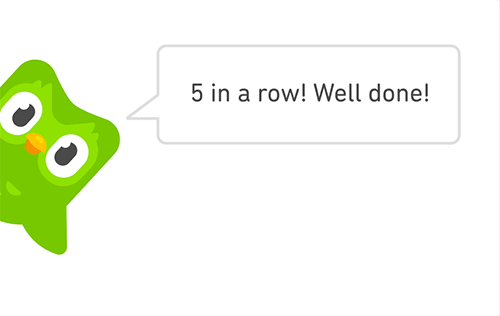
If you’ve ever used Duolingo, you already know the feeling, even if you may not have a word to describe it. You complete a lesson, and suddenly, confetti bursts and the owl is cheering you on. It’s a very small and subtle interaction, but it makes you smile. You feel happy, and want to continue learning more to see that same cheering again. That small act of celebration is exactly what a microinteraction is, a detail that is so tiny and it often goes unnoticed, but it's powerful enough to keep the experience alive.
These small design moments are what makes an app not only look polished, but it makes them feel human. When I tap a heart on Instagram, and it blooms red for a moment, I feel a kind of confirmation, like the app understood me. When I check off a task in Notion, and it fades away smoothly, there's satisfaction that feels almost physical.
Microinteractions are small animations that are triggered as a response to a user’s action that can transmit feedback in a delightful and eye-catching way. Microinteractions improve the user experience that helps make designs better. A common framework was developed to explain the parts of microinteractions where it is trigger, rules, feedback and loops. [ add in examples for each part ]. Some examples include button presses, hover effects, progress bars, and toggles. They can help the user navigate through the application, reducing confusion and enhancing user trust. Microinteractions matter in user experience because they can provide feedback to users, making the system feel more intuitive and alive.
Microinteractions are real psychological tools that can satisfy user needs for feedback, emotion and predictability that go beyond the expected design polish. These all make digital experiences more warm and feel human. Research shows that 88% of people will not return after a poor user experience and 90% of users will stop using an app due to poor performance.
In this article, we’ll explore why these details capture us so easily. What is about a spinning loader, or a confetti burst that makes us trust a design more. I’ll look at it through three psychological principles behind microinteractions such as feedback & control, emotion & reward, and storytelling through motion.
Innately, all humans crave closure and want to feel in control. Imagine, if you press a crosswalk button, and it lights up, you will feel reassured that the light will signal that you can start walking soon. But if nothing happens, you will keep pressing it again..and again.. just to be sure. The same thing will happen in digital design.
When we tap on a button or submit a form, we instinctively expect a response. The tiny flash of animations or a color change is what the system reassures us “you've been heard”. Without that confirmation, uncertainty begins to creep in, and uncertainty, psychologically, is very uncomfortable for us humans. This ties into self-determination theory, where autonomy and control can increase greater satisfaction in life.
In psychology, this idea connects to something called a feedback loop. When the result of an action becomes the input for the next action. In UX terms, it would look like when a user performs an action, the system responds, the user learns and continues that behavior. This also relates to operant conditioning which is the principle that behavior is strengthened when it is followed by a rewarding or confirming response.
When the design acknowledges our actions, even subtly, it's teaching us how to use it. And that is what allows us to continue repeating that behavior over and over, and it is a small quiet conversation between the system and the user.
There is also the psychological tendency to better remember unfinished or interrupted tasks than completed ones as defined by Zeigarnik Effect. This is because uncompleted tasks bothers the mind. So in UX, when a UI shows a checkmark or loading bar when a user is waiting for a task to complete, it gives psychological relief. That’s why progress indicators matter so much. Think of the blue bar that moves along when you upload a Youtube video, or the gentle ding when a file finishes saving. It’s not just functional design, that is reassuring the user that the system is working. This connects to completion bias, which is our urge to finish what’s nearly done.
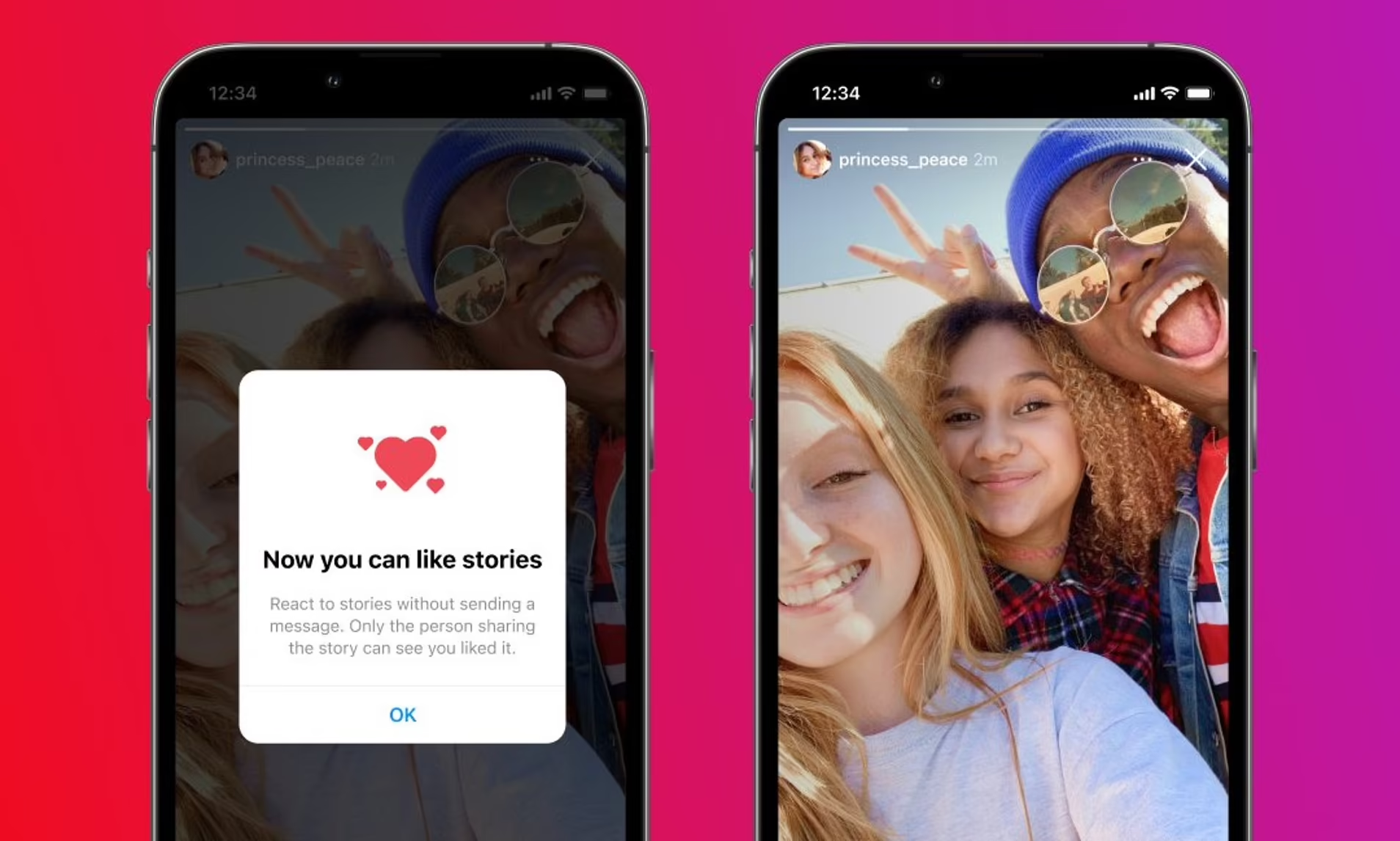
This makes the act of animation, which makes the act of liking a photo or image feel personal.
.jpg)
Waiting is already slightly frustrating for users, but seeing the progress bar while waiting makes it feel less stressful because users actually see progress.
However, when there’s no response from the system, the trust breaks. We’ve all been there, when we are clicking a button that is doing nothing, or when you are submitting a form, and it just freezes. These small design errors can cause the user to become frustrated and lose trust. In design, consistency matters the most, and these micro-interactions create trust. These unresponsive buttons, and delayed feedback break the invisible connection between the user and product. Once the trust breaks, the frustration starts to set in, making the users feel put off by the product.
When you complete a task in Asana, a small checkmark slides across the screen sometimes with a unicorn that flies by. It’s not random, it's actually behavioral psychology. That moment of joy has been carefully designed, and it's what psychologists call positive reinforcement, where there is a cue that rewards behavior and encourages us to continue repeating that action. A theory that builds off this is BJ Fogg’s Behavior Model, which suggests that three elements must occur for a behavior to kick in which is motivation, ability and a prompt.
Microinteractions build on this principle. When designs celebrate user progress with animation, sound or gentle motion, they’re tapping into the brain’s reward system. This result causes a release of dopamine which is a neural transmission that creates feelings of pleasure and reward. Small victories can trigger the release of dopamine, which creates a positive feedback loop. Over time, these small wins create habit loops, which can cause users to associate the product with positive emotion, and the engagement on the product becomes natural and not forced.
Duolingo’s confetti and owl cheering you on when you complete a lesson wants you to continue learning.
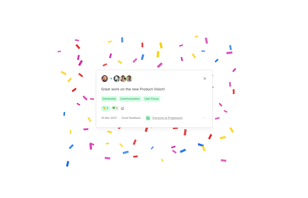
Slack’s confetti when a group achieves a milestone gives a sense of satisfaction and celebration.
Asana’s animal celebrations when a user completes a task gives motivation when completing tasks. It (hopefully) motivates users to keep working hard on their tasks!
Good design doesn't just communicate functionality, but it also communicates emotions. All of these examples such as Apple Pay’s subtle vibration when a payment goes through, checking off a task in motion, and the celebratory confetti in slack, all achieve the same goals, which is that they make users feel seen. These microinteractions make these logical tasks feel like human experiences.
Just as a smile can lighten up a serious conversation. Small animations or sounds can make digital experiences feel more light. Adding emotion in design builds connection to users, and connection builds loyalty to the product.
However, these animations, when overused, can lose their meanings. Too many pop-ups, noises, or bounces. This will cause the user to become frustrated. Psychologists call this effect hedonic adaptation where humans can quickly return to a stable level of happiness regardless of all the positive or negative life effects. In UX, this means that constant bursts of confetti or exaggerated animations can quickly lose their impact. They can quickly become performative, rather than genuine. Users can become tired and distracted instead of seeing too many effects, which can create more confusion instead of clarity.
A good example of effective design is Apple notes, which has a minimalist user interface, and allows users to focus on their tasks efficiently. However, comparing that to an app like Robinhood, which uses many gamified graphs and flashy movements can risk turning financial decisions into distractions. Instead of helping users understand financial trends, such vivid visual animation can make the experience turn into a game instead of a financial tool. When apps overload users with too many pop-ups or colours, it can lead to confusion and lead them to get distracted.
The best designs understand restraint and balance. It’s critical to know when to celebrate, when to pause, and when to exonerate the design. Subtle cues are the way to go. They can often create more long lasting satisfaction than loud constant stimuli.
In recent designs, animation has become a widespread growing trend. The way that elements can move, tells users how to feel about what they’re doing. Every animation has timing and intent, it's very much like visual storytelling. An example of this is when a card slides away or fades in and changes the entire tone of the app. Just like when movies use camera movements to direct focus, digital experiences can use motion to direct emotion and attention.
Psychologists would explain this using the concept of Gestalt principle of continuity states that the human eye tends to follow the smoothest naturally. In design, it's important to consider this fact, because motion helps users anticipate what's going to happen next. Predictability is very powerful. When motion is consistent, users subconsciously feel secure. For example, consider in Apple Pay, the card will slide upward and the success tick appears with a subtle vibration. This motion is used to show cause, which leads to the effect which is that payment being sent, which reduces uncertainty and gives a sense of control. This is directly related to the Zeigarnik effect which considers that users get relief after a task completion.
Some examples of major industries that use different motion to tell a story are as follows, banking and creative apps.
Banking apps have smooth, clear transitions because this helps them imply trust and stability in the users.
![fun_animations.gif [optimize output image]](https://cdn.prod.website-files.com/67c32dd791930df22c466f00/68f7d05ed6c920aec8ef80dc_ezgif-839e98a00bf7b6.gif)
Creative apps have bouncy, fun transitions that can express energy and playfulness in the designs.
So by the end of this article, I hope I have convinced you to at least try some microinteractions in your designs. Microinteractions are not just design adders, but they bridge logic by having feedback that builds trust, emotion that reinforces behaviour and motion that tells stories.
They may be invisible at first glance, but they’re actually what makes the apps feel alive. Through feedback and control, microinteractions can reassure us that our actions matter. They reduce uncertainty, and give us a sense of trust and predictability in our systems. Through emotion and reward, they can connect us to feel on a deeper level. Through motion, they can give personality to the inanimate, which can turn designs from experiences into something that feels more human.
So remember that the next time you see a heart tap, that it is behavioral psychology at your fingertips. In the end, great UX is not just about buttons or colors, but it’s about those tiny gestures that can signal to users like “I see you!”. That is what makes systems make more humans and that creates the trust needed to increase brand trust.
Supercharged Studio is a creative technology agency that crafts websites, apps, logos, and brands. We help emerging innovators, industry leaders, hustlers, and dreamers create a competitive edge through design.
Your ideas will like it here.


.jpg)