
Discover how to design a luxury brand people truly emotionally connect with across its visual identity, logo, brand strategy, storytelling and more.
I've seen a lot of founders try to "go luxury." They pull a muted palette off Pinterest, pick a serif, write some vague copy about excellence, and call it a brand. Then they wonder why their ideal clients don't feel anything.
Here's the thing: quiet and minimal is one way to do luxury. It's not the only way, and for a lot of brands, it's not even the right way.
Balenciaga charges $1,400 for sneakers and plasters its logo across every surface. Supreme built an empire on a red box logo and aggressive drops. Jacquemus does playful, oversized, borderline absurdist fashion and charges a fortune for it. These are luxury brands. None of them are whispering.
I've built brands across a few different worlds now. A travel agency approaching 25 years in business. A luxury handbag rental membership. A dance shoe brand built by actual dancers. A travel streetwear label I founded myself. What I've learned is that luxury is more than an aesthetic. It's a feeling. And the aesthetic is just the vehicle you choose to deliver it.
Let me show you how.
Two brands. Completely different looks. Both unmistakably luxury.
The first: a heritage private wealth firm. Ink and ivory. A rearing horse in a crown. A serif wordmark with tight tracking. Everything speaks in low tones. You look at it and you know, somehow, that a lot of money flows through here.
The second: a luxury streetwear label. Big logos. Bold colour. Drop culture. Extremely online. The brand talks to you in memes and makes you feel like you're either in on the joke or you're not.

Both are charging significant prices. Both have fiercely loyal customers. Both are succeeding.
What do they have in common? They know exactly who they're for, and they do not care about anyone else.
This is the distinction most founders miss when they start thinking about luxury branding.
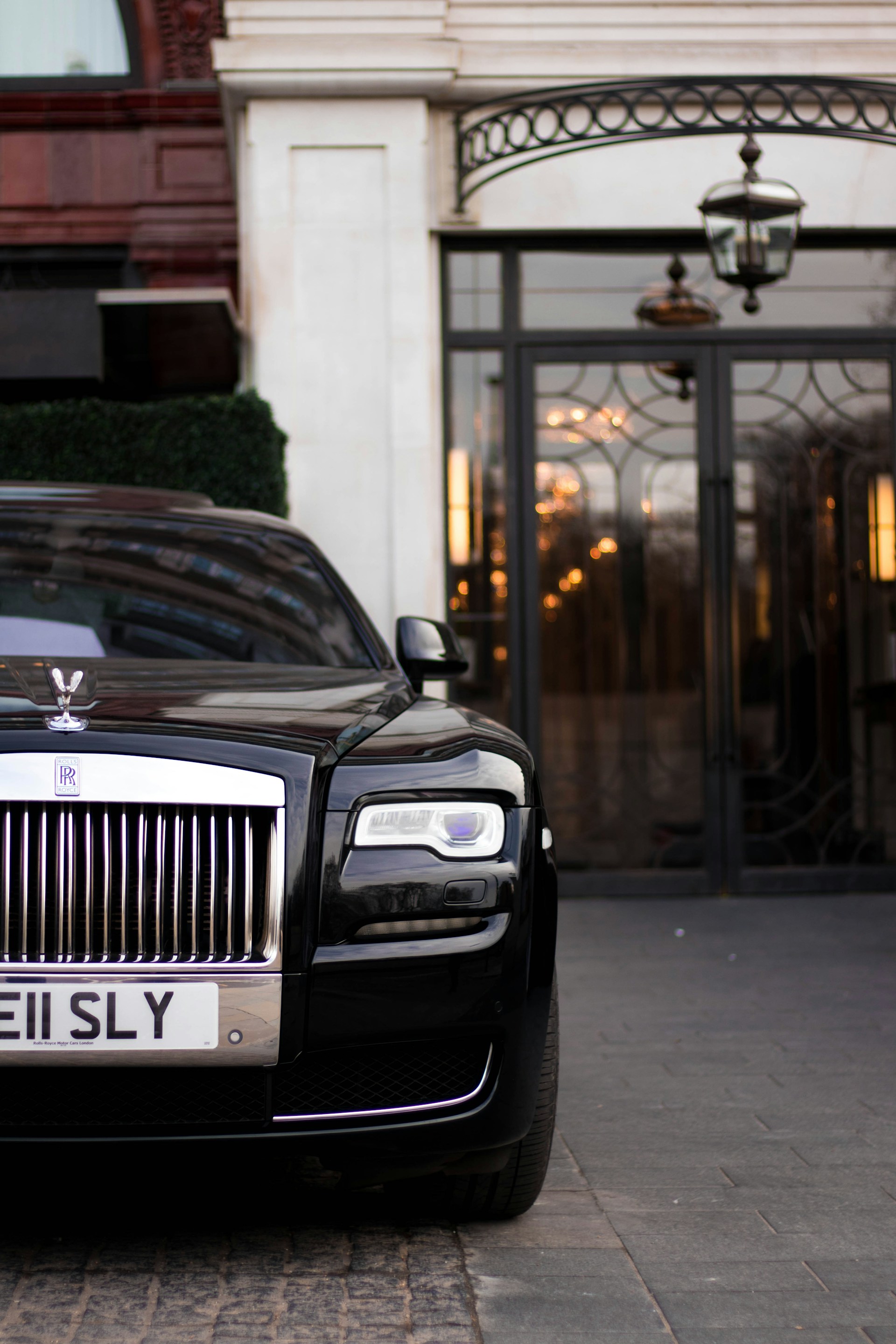
Old world luxury is inherited. It's the Hermès saddle maker turned handbag empire. The Swiss watchmaker. The hotel that has been in the same family for four generations. The brand signals are quiet because they don't need to explain themselves. Their customers already know. Discretion is part of the status.
When we rebuilt the identity for Panache World, a luxury travel agency approaching 25 years in business, the direction was clear: understated, contemporary, timeless. Nothing flashy. Nothing that needed to be decoded. The brand video we launched hit 200,000 views in the first week, not because it was loud, but because it was unmistakably right.

New world luxury earns its status differently. It's not inherited. It's claimed. The aesthetic can be maximalist, referential, even ironic. The Gen Z luxury consumer grew up watching brands perform exclusivity online. They understand the codes of luxury, and they've built their own.
This is where loud works. Not because loud is inherently luxury, but because for this audience, visibility is part of the value. Being seen in the right thing, by the right people, in the right context, that's the product.
The rules are still strict. The execution still has to be impeccable. But the aesthetic register is completely different.
Here's what never changes, regardless of which register you're working in.
Luxury is not about price. Price is a signal, but it's a secondary one. What you're actually selling is a feeling. Belonging. Access. Recognition. The sense of entering a world that has been deliberately curated for a specific kind of person.
And that world has to be consistent. Every touchpoint has to earn its place. One mismatched element, one cheap-feeling interaction, one piece of copy that over-explains, and the spell breaks.
The brands that get luxury right don't try to appeal to everyone. They try to feel exactly right for someone.
This is where the actual design work starts. Not with a moodboard. Not with a colour palette. With a very precise answer to one question: who is this brand actually for?
Not demographics. Situations.
What does your buyer already own? What do they dismiss before they even look at it? What would make them feel genuinely seen versus pandered to? What are the conversations they have that most people are not part of?
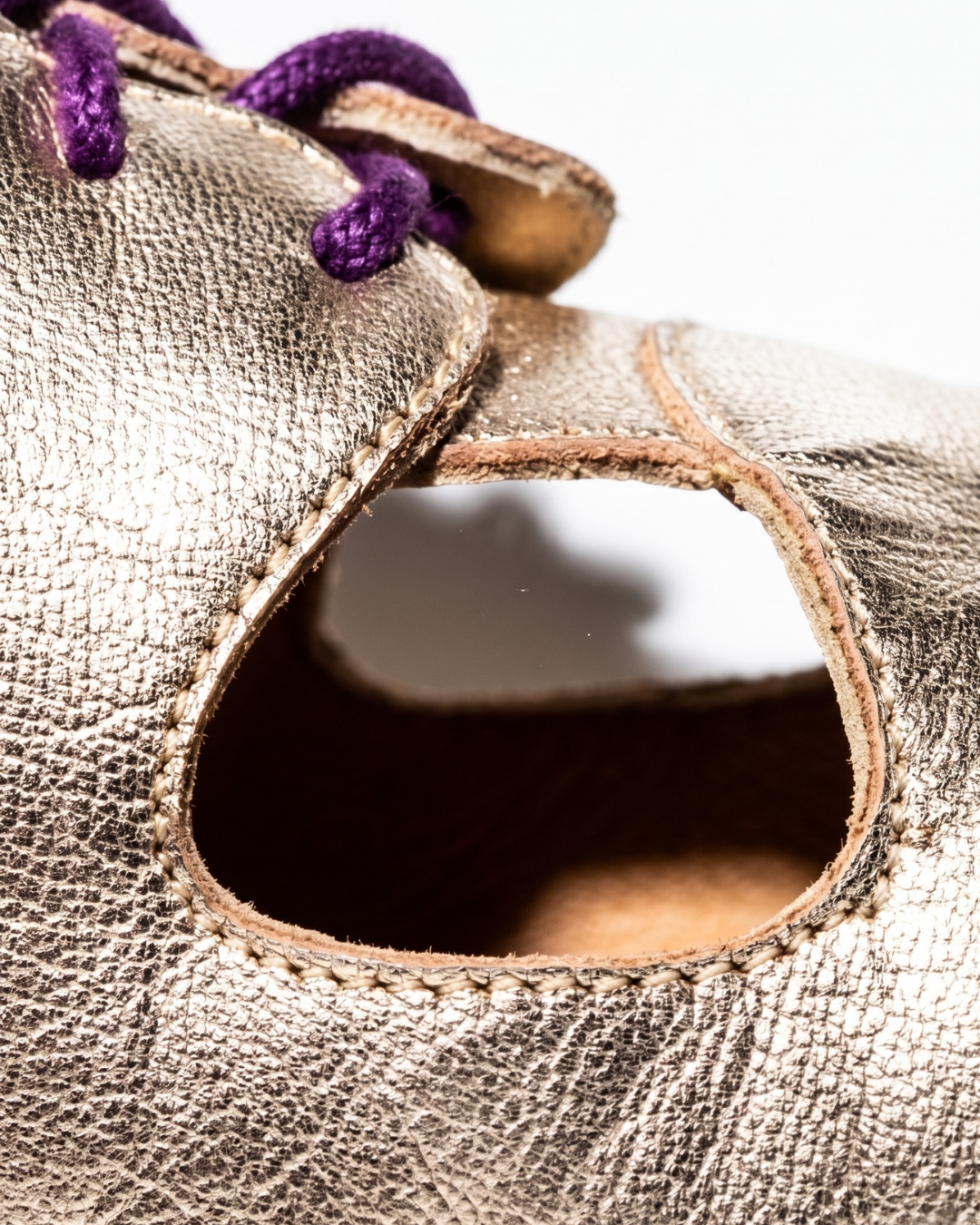
marleys is a dance shoe brand built by actual dancers. The product is $350, handcrafted from Portuguese leather, designed around real foot anatomy. When we worked on this brand, the buyer wasn't "someone who likes dancing." It was the social dancer who has already burned through three pairs of cheap shoes. The person who knows what their feet feel like after four hours on the floor in the wrong pair. That person already knows what they need. The brand just had to speak to them about something they already feel.
"We didn't design our dance shoes in a boardroom." One line. That's the whole audience brief delivered back to them as a brand truth.
That's how you figure out your audience. Not by profiling them. By finding the situation only they know, and naming it.
This one trips founders up.
When they hear "your brand will exclude people," they think it means lost revenue. What it actually means is that you're doing luxury correctly.
A luxury brand that tries to be understood by everyone has already failed. The wrong person should look at your brand and not fully connect with it. That slight sense of "I don't think this is for me" is exactly the signal that it's working for the right person.
Intentional disqualification is a feature. It's what makes the right customer feel like they've found something built for them.

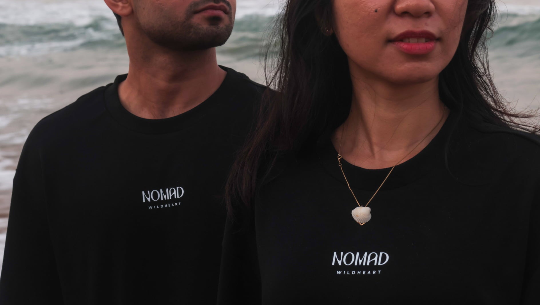
Nomad Wildheart is a travel streetwear label I built around a single idea: this brand is not for tourists, it's for people who travel as a way of life. The tagline is "Souvenirs are for destinations. We're for the journey." A tourist picks it up and puts it back down. The person who has lived out of a carry-on for three years reads that line and buys immediately. They weren't sold. They were recognised.
Zero Collective works the same way. A luxury handbag rental membership is not for the person who hasn't thought about their relationship with fashion yet. The brand had to feel elevated enough to attract a woman who already knows the difference between a house and a maison. If the design didn't pass that test on sight, the wrong customer would show up. Building that elevated feel into an MVP, with real design discipline, is exactly how it worked.

Once you know your audience and your register, the visual decisions stop feeling arbitrary. They become obvious.
Choose colour for what it means to your specific buyer, not what "luxury" generically looks like. A muted palette that reads expensive in a wealth management context might read clinical in a fashion context. A bold red that reads aggressive in one category might read bold and courageous in another.

Ask yourself: when my buyer sees this, what do they feel? Is that the feeling you're selling?
Old world luxury reaches for heritage. Serifs with history. Tight tracking. Restrained weight contrast. New world luxury reaches for disruption. Display fonts with attitude. Unconventional sizing. Type as a visual statement before it's a communication tool.

Both are intentional. Neither is wrong. Both will feel wrong if you pick the one that belongs to the other world.
Negative space communicates confidence. It says we don't need to fill every inch to earn your attention. Maximalism communicates energy, abundance, attitude. It says we're everywhere and you want to be part of this.
Know which one your buyer responds to. Then commit.
In luxury, the logo is a mark, not an explanation.
It doesn't need to describe the business. It doesn't need to be memorable to everyone. It needs to be immediately recognisable to the right person and quietly invisible to everyone else.

That's why so many luxury brands land on wordmarks or minimal monograms. The name, set in the right typeface with the right tracking, is already doing the work. You don't need a symbol on top of that to make a point.
When you find yourself wanting to add more to a logo, that's usually a sign you're not confident enough in what you have yet. Strip it back. The right luxury logo earns its elegance through what it leaves out.
Luxury brands don't explain themselves.
They don't list features. They don't over-justify the price. They don't write copy that sounds like it was approved by a committee. They write like they're speaking directly to one person who already gets it.
Short sentences. No hedging. No exclamation marks. No "we are passionate about delivering exceptional experiences." That sentence has never made anyone feel anything.
The opening line we wrote for Elan, a firm built for NRI professionals managing cross-border wealth: "Walk into a room and be taken seriously before the founder says a word." One sentence. It names a real feeling. The right person reads it and doesn't need to be convinced of anything else.
If your copy could apply to any brand in your category, it is not luxury copy. It is just copy.
The thing that surprised me most building luxury brands is how much of the work happens before any design starts.
Clients who come in already knowing their audience, their register, and the feeling they want to create, those projects move fast and they land right. Clients who come in with a reference folder full of luxury aesthetics they like but no clear answer to "who is this for and what should they feel," those projects take longer. Not because the design is harder. Because the brief wasn't clear enough to build from.
Luxury is not a mood. It's a position. You earn it by making every single decision serve one specific person's experience. When you get it right, the right person looks at the brand and feels something before they've read a single word.
That's the whole thing.
No font, no colour palette, no well-curated moodboard makes a brand luxury.
What makes a brand luxury is the accumulation of decisions, each one made for the right person and no one else. The colour that lands. The logo that doesn't need to explain itself. The copy that names a feeling instead of describing a service. The website that breathes. The touchpoint that feels exactly right, every time.
Luxury is earned when every element adds up. And the moment one element doesn't pull its weight, the spell breaks.
If you're building something that's genuinely not for everyone, you're on the right track.
Supercharged Studio is a creative technology agency that has crafted websites, apps, logos, and brands across multiple businesses in the luxury space. We help emerging innovators, industry leaders, hustlers, and dreamers create a competitive edge through design.
Your ideas will like it here.
Supercharged Studio is a creative technology agency that crafts websites, apps, logos, and brands. We help emerging innovators, industry leaders, hustlers, and dreamers create a competitive edge through design.
Your ideas will like it here.



.jpg)
